Ex-Ideo Designers Rethink The Calendar For Mobile Devices
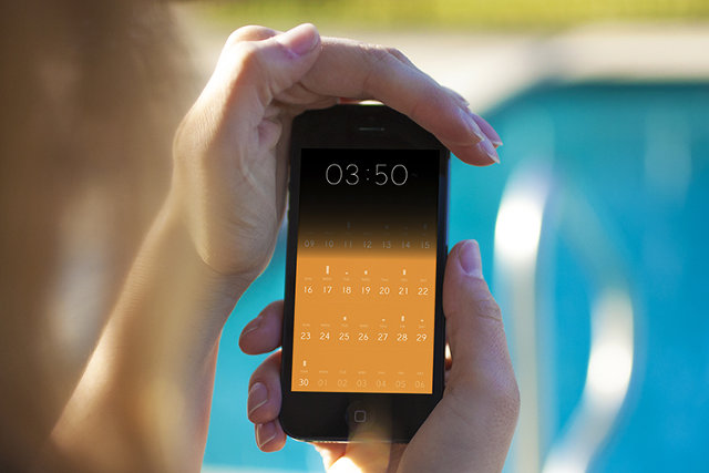
Have you ever opened up a calendar app on your iPhone and wondered why almost the entire screen is taken up by a grid of tiny boxes, most of which represent the past, and all too small to contain any useful information? Amid Moradganjeh has, too. He and his team of ex-Ideo designers have created Peek, an app that throws out most of the assumptions we've attached to digital calendars and rethinks the experience from a minimal, mobile-first perspective. At first glimpse, Peek seems to have a lot in common with Clear, the influential gestural to-do list app. Like Clear, Peek has a flat, "chromeless" interface built around chromatic tiles and clean typography, with accordion-like animations that "unfold" information when you tap on the tiles. "Apps like Clear proved that simple tools that don’t try to do too much can sometimes be more useful," Moradganjeh tells Co.Design. "This is mainly the case for the group of people that are not necessarily that busy, and therefore, don't need an app that thinks for them."
According to Moradganjeh, Peek is aimed at this class of casual calendar users: people who aren't overscheduled CEOs or GTD geeks, but just folks who have stuff to take care of. "For this group, if using a calendar app is not easier than remembering things or writing them on a piece of paper, then they would not use it," he says.

That's why Peek looks more like a strip of brightly colored Post-It notes than a gridded database of appointments. The first things you see when you launch Peek aren't even dates; instead, the app displays large tiles simply labeled "TODAY" and "TOMORROW." Scrolling down further reveals more tiles labeled with forthcoming days of the week. "We learned that people don't perceive time in the form of grids and pages," Moradganjeh says. "So we explored the river model, in which a calendar is a unified timeline with the focus being on the near future." (Scrolling further down or up in this "river" does eventually display a more traditional grid of dates, which makes it easier to reach events further into the future.)
Moradganjeh says that he based Peek's design on mobile interaction principles he investigated in Rimino, a student concept project he created two years ago (which we covered here). Rimino imagined a post-smartphone device built on lightweight, glanceable notifications rather than visual, highly focused interactions. Instead of displaying a dense thicket of appointment information, Peek surfaces simple, bold reminders that function less as an "outboard brain" for your schedule and more like a red string tied around your finger that helps visually trigger what you already know.

"We learned that most of the time, [casual calendar users] only need the information that can help them 'remember' their schedule," Moradganjeh explains. "This means that an event like 'Lunch with Adam at 12:00' is enough useful information for a user who knows already where she needs to meet Adam."
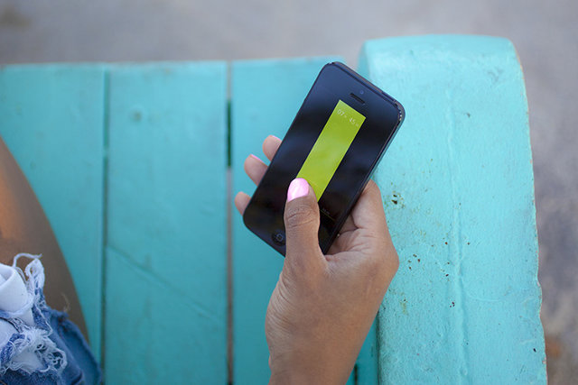
Peek contains some extra interactions that run the gamut from genuinely clever (covering the iPhone's ambient light sensor with your hand or thumb displays a large clock) to extraneously gimmicky (shaking the phone makes Peek cough up aspirational suggestions like "Take the time to relax!"). And the jury's still out on whether focusing an app's UI on gestural interactions isactually convenient or just a passing fad. But Peek's core concept--that most "normal people" don't need deep features and artificial intelligence to help them manage their time when simple, mnemonic microinteractions will do just fine--is a refreshing take on mobile design.
Source: http://www.fastcodesign.com/3025671/ex-ideo-designers-rethink-the-calendar-for-mobile-devices