The role of a product owner is quite demanding. It requires applying and adapting a wide range of skills spanning across a broad view of subject knowledge, excellent communications, and multi-tasking capabilities.
Read MoreUX
Design Thinking: an enabler for social innovation? /
The creative problem solving approach of Design Thinking attracts more and more companies who see in it the means to help them break out of the old moulds they have become stuck in, to create alternative ways of looking at a problem
Read MoreWhy your Blockchain Startup Needs UX Design /
Technology needs design — more than ever
Well-designed products that meet the standards of today’s discerning consumers and create an atmosphere of trust will be the most likely to succeed in bringing this new technology to fruition
An Analytics-First Approach to UX, Part 1 /

Usability testing and analytics make for a dynamite team, enabling us to learn about our users, track our goals, and troubleshoot unexpected problems. When it comes to troubleshooting, analytics tell us what pages or journeys are causing problems for users, and helps identify what areas we should focus on in usability testing. The usability tests will then tell us why users are behaving in those specific ways. Between the two, we can provide focused, user-specific recommendations for site owners.
In the case of Sophia (and many other UX practitioners like her) analytics show exactly how users are accessing the website. Though her background in UX, and her client’s customer know-how might have resulted in good assumptions about what to test, analytics showed them how people were using the website in a clear, unbiased way.
For anyone willing to learn a few simple tools to read them, analytics helps:
- identify problem areas on a website
- show how users are engaging with a site
- measure the results of any design improvements
In this two-part series, I’ll explain how to use analytics to identify where users are having issues, and what areas of a site will most benefit from usability testing. Today’s article focuses on three metrics to identify problems on a web site: bounce and exit rate, average time on page, and page value. In part two, we’ll move on to using these metrics to identify drop off points, and then we’ll dig into segmenting the data to pick up on additional details.
IDENTIFYING PROBLEM PAGES AND SECTIONS
As a freelance UX consultant, I’ve worked on a wide range of websites across multiple industries, and the process consistently begins with analytics. I start by identifying how many users visit the site daily, and which pages are the most popular. This gives me an overview of how people are using the site. I then move on to identifying potential problem areas, which will later become the focus of my UX recommendations.
In general, I look at three types of metric to identify problem areas:
- Bounce and Exit rate
- Average time on page
- Page value
BOUNCE AND EXIT RATE
“Bounce rate” and “exit rate” are two metrics that can cause confusion. Bounce rate is the percentage of users who visited just that one page of a site: arriving on a page but then leaving without viewing any other pages on the site. Exit rate is the percentage of people who leave the site from a page; this includes people who have visited other pages on the site previously.
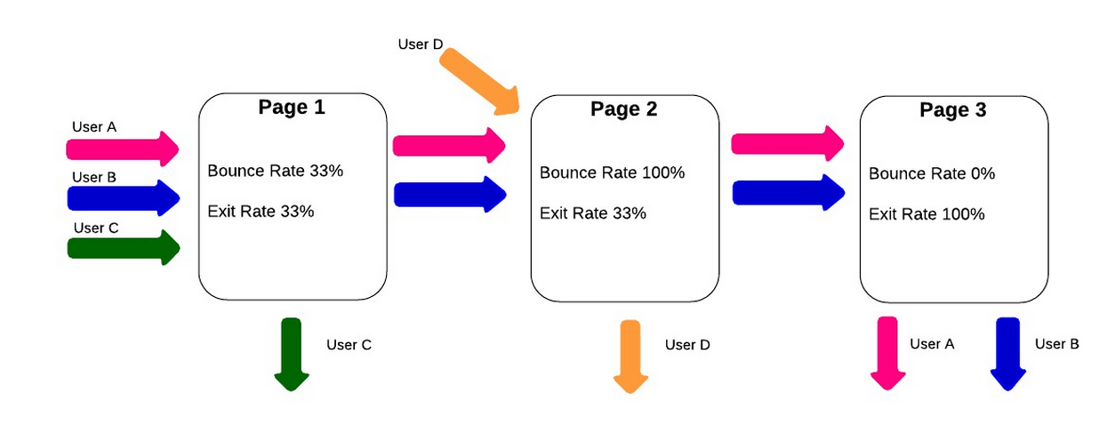
If I notice a section of the website that shows a high bounce or exit rate, I make note of it, in case something on a particular page is driving away visitors. A page with a high bounce rate may indicate that the content on the page wasn’t what the user was expecting when they arrived there. A high exit rate may show that this page is causing the user to drop out part-way through their intended journey—on the other hand, if the page with the high exit rate is the final page in the journey, then the exit rate is not a problem at all.
Using the “weighted sort” option in Google Analytics makes the bounce rate metric even more valuable. According to Google Analytics “Weighted sort sorts percentage data in order of importance instead of numerical order.” To give an example, a page may have a 100% bounce rate, but if it only had one visit in the last month then only one person left the page (and a bigger issue may be that no one is visiting the page!). If the page has an 80% bounce rate, but is a key starting page in the user journey, then the site could be losing a lot of business. Recognizing whether the problem is that no one is visiting the page or that everyone visiting immediately leaves the site is crucial to preparing an appropriate usability test around the page in question.

AVERAGE TIME ON PAGE
“Average time on page” is the average amount of time that users spend viewing a webpage. If I see a page with a low “average time on page,” it may mean the page is under-performing by not holding the user’s attention. On the other hand, if users are spending a lot of time on a checkout page, it might be because the page is overly complicated. Of course, all metrics should be viewed in context; if a blog article has a high “average time on page,” it’s generally a good sign, since it may imply that users are actually reading the whole post.
Another good way to quickly gauge how pages are performing is to use the “compare to site average” display option. This is a graph that shows whether pages are significantly above or below average for the selected metric. They will still need to be analyzed on a page by page basis, as different pages have different objectives, but pages with a lower than average time on page are likely to be an issue, assuming the purpose is to keep users reading. The example below clearly shows that the “Contact” page has a lower time on page than the site average, while the “Blog” page has a time on page of over 80% higher than the average.

Again, context is key here. Users may be arriving on the contact page to check the address of a company, or to find their phone number. If they successfully achieve this then they will leave the site, so a low time on page here can be good sign that the page is performing efficiently. A “blog” page is expected to hold a users’ attention, so the higher than average time on this page could be seen as a good thing.
PAGE VALUE
An important, but underused, metric for spotting poorly performing pages is “page value.” Page value, as the name suggests, is a way to give a single web page a direct monetary value. It pulls the values in from a combination of transaction revenue, for ecommerce sites, and goal value for all other types of websites, both of which need to be set up manually in Google Analytics for a page value to be calculated. A high page value will often be a sign of an important page, which indicates that it is a good page to focus on during usability tests.
High value pages that show a high exit rate are a good area to focus on for improvement. These are pages where users are dropping out at a key part of their journey to conversion. In the example below, taken from an ecommerce site, I’ve highlighted three categories with a similar page value. It is clear to see that there is a far higher exit rate for the Personalised Toys product page. This shows that this is a high value page that’s “leaking” users, and should be the focus of future UX work.

Looking at individual pages will only show part of the picture though. It’s important to use the “content grouping” feature to look at how whole sections of a website are performing. Content grouping is essentially a way to segment data by the types of pages that users visit on a website. Pages can be grouped in a variety of ways. For a site that sells clothing, for example, groups could be set up for each type of clothing, showing whether pants have a higher page value than shirts!
Once a page or section has been identified as having a low page value the next step would be to find out why this might be the case. In the example above it’s been shown that shirts have a comparatively low value. My first step here would be to look for any clear UX or technical issues on the shirts pages, using my experience and judgement. After doing this I would test the page, or pages, with real users to see why they are experiencing these issues—and look for clues indicating how we would fix them.

Content Grouping can be a really powerful way to see how different parts of a website are performing.
USING METRICS IN PRACTICE
This is the first step in using analytics to identify website problems. In the second part of this series, we’ll look at how to identify drop-off points in the user journey and how to segment users to see more details.
In the meantime, try identifying potential problems using the methods from this article:
- Pull up the bounce rate to find pages users land on and immediately leave.
- Read through the exit rate of pages to see where in the customer journey users leave the site.
- Factor in the importance of a user’s average time on a page—a high bounce rate on a blog page, combined with a long average user time is actually a good thing!
- Look at the pages ranked by page value. The higher the page value, the more important it is to usability test, and ultimately fix problems users are having on the page.
Source: http://www.uxbooth.com/articles/an-analytics-first-approach-to-ux-part-1
How Prototyping is Replacing Documentation /

Working at a design consultancy, documentation is often the primary deliverable we hand off to clients. When dealing with complex interactions, it’s not uncommon for documents to be over 100 pages long. Drafting these types of deliverables takes serious care, attention to detail, and significant time working at high fidelity in programs like Illustrator and Photoshop.
The big concern is that when designers ship their work to clients, the final documentation doesn’t become the final product regardless of how well it’s crafted.
“Documentation could be overlooked, ignored, or simply out of date by the time it comes to actually implement a feature if we’re working with a very agile development team.”
This is something Jason Frasier, design director at DesignMap, said when he stopped by Tradecraftlast year to share his perspectives on prototyping. He discussed how it's replacing documentation as a UX deliverable, and how we can utilize prototyping in our design process.
Documentation is inflexible. Often, the effort involved keeping things consistent when changes are made can be more challenging than creating the design itself. In all, documentation can’t always meet the evolving needs of a client when they prepare to ship their product and that is problematic.
Prototypes are Powerful
"People don’t read products, they interact with them."
Creating a prototype as a final deliverable allows for greater interaction with the product and a deeper-level understanding of how the product is experienced. It can also easily be adopted for usability testing and iterated on quickly and efficiently to push out new versions.
Prototyping is also an impactful way to present to your client. People know how to interact with products. Demonstrating interactions with a prototype helps to spark well-informed discussions with clients and can lead to better design more quickly.
When discussing prototyping, it’s important to understand the methods and know when to use them. Jason went over five prototyping techniques that he thought were important to utilize at different parts of the design process.
How to Utilize Prototypes
Here’s Jason’s breakdown of how to use prototypes as you move through the design process.
Paper Prototype
- Creating rough, hand-drawn sketches of UIs to put in front of users for testing.
- When to Use: When you want to validate basic design ideas and understand rough interactions before going forward at a higher fidelity.
- Presentation: Paper cutouts
Vision Prototype
- Creating a presentation that quickly runs through an interaction at high fidelity.
- When to use: When you want to wow your client. When it’s more about the polish than the actual experience. If you need to sell an idea.
- Presentation: Keynote
Click-Through Prototype
- Creating a set of static wireframe slides and discussing slide interactions.
- When to use: When working with developers and project managers to demonstrate a linear flow through an experience quickly and efficiently.
- Presentation: Invision, PDF
Wireframe Prototype
- Creating a clickable wireframe prototype that can be put in front of users.
- When to use: When conducting user testing or demonstrating interactions to clients at a higher fidelity.
- Presentation: InVision
High Fidelity Prototype
- Creating a prototype that closely resembles the real product.
- When to use: When your product is nearly ready to ship.
- Presentation: Web browser, mobile device, InVision.
Conclusion
If you’re a UX designer, knowing how and when to prototype is already a requisite skill. Now, teams are transitioning from documentation to prototypes as final deliverables. Prototyping can make your design process more agile, allow you to express complex interactions elegantly, and present your work to your client in a more dynamic and iterative way. Avoid 100+ page documents and start prototyping.
The Grid Raises $4.6M For Its Intelligent Website Builder /
The team behind The Grid is developing a website builder that uses artificial intelligence to automatically create new sites based on the content you provide. The company ran one of the most successful crowdfunding campaigns for a software product earlier this year, but the team also went out to raise a larger fundraising round.
As the company today announced, The Grid has raised $4.6 million in a Series A round led by Jerry Yang’s AME Cloud Ventures. Other investors include former President of Disney Interactive John Pleasants, former Facebook VP of Product and Engineering Greg Badros and the founder of Elegant Themes Nick Roach, who also led The Grid’s $3.1 million seed round.
“The Grid’s cloud-based artificial intelligence will reinvent web design by eliminating the mundane, time-consuming parts of web development and creating elegant websites in a fraction of the time for a fraction of the cost,” said Yang in a canned statement today. “This will completely reinvent modern web design for everyone.”
The Grid CEO and co-founder Dan Tocchini gave me a demo of an early build of the service last month. It’s still rough around the edges — especially the user interface on the backend still needs quite a bit of work — but so far it looks like it could actually fulfill its promise of allowing anybody to quickly create a good-looking website without the need for any templates. The Grid’s own homepage is built with this early version of the software and it’s a good example of what these sites will look like.
The software does a deep analysis of all the content you want to add to your site. It does sentiment analysis for the text you want to add, for example, and look at whether people in your photos are smiling to determine what kind of fonts and colors it should use. It then looks for low-contrast areas in your photos to figure out where it can put text on an image. The tools can also automatically crop images based on The Grid’s face-detection algorithms, and the service looks at the overall color spectrum in those images to help decide the color palette for the site.
In its current form, the service is clearly meant for content-heavy corporate or portfolio sites. It’s not optimized for blogs or news sites, but Tocchini noted that it could be used to create Snow Fall-like experiences.
Right now the team is targeting the end of spring 2015 for the launch of The Grid. Users who sign up for early access can still sign up to get the service’s discounted rate of $8 per month. Users who sign up after the launch will pay $25 per month.
Gestures & Animations: The Pillars of Mobile Design /

Pointing and clicking? That seems like an awful lot of work …
The ease and functionality of mobile devices is shifting the way we think about interactivity. Smartphones, tablets, and laptop hybrids are ushering in a new age of UI that favors a more direct form of interaction, one where mouses are optional. While a few years ago you could chalk up mobile devices’ popularity to being new and different, today we’re forced to admit there’s something else behind their lasting success. Users are finding that the control system of gestures—made viable by animation—are more than merely entertaining, they’re useful.
Gestures: The Intuitive Mouse
A study by Dan Mauney, Director of Human Factors & Research at HumanCentric, shows us that gestures might be more intuitive than we once thought. According to the notes by Luke Wroblewski, the study asked 40 people in nine different countries to create gestures for 28 tasks like deleting, scrolling, zooming, etc.

While this is a topic worthy of its own article, the important thing to note here is that the gestures tended to be similar across culture and experience. For example, when prompted to “delete,” most people—regardless of nationality or proficiency with mobile devices—tried dragging the object off screen. The differences between cultures and familiarity with touch devices was slim (although the Chinese seemed to favor symbolic gestures). The biggest differences arose in scrolling, where some gestured up and others gestured down, depending on which mobile device, if any, they were more familiar with.
What this tells us is that gesture-based controls seem to come naturally to us, or at least can be picked up quickly. If that alone isn’t reason enough to embrace it, let’s take a more practical look.
- Less Clutter: As if the size limitations on mobile devices weren’t bad enough, the common lack of a keyboard means often the UI control panel is squeezed onto the screen, sacrificing valuable content space. But the more an app/site relies on gesture controls, the less buttons on-screen, and thus more content.
- More Fun: While this may not seem like a practical factor in making a business decision, the fact is people will choose a fun app/site over a slightly more useful one.
- More Potential: Every corner of mouse pointing-and-clicking has pretty much been explored by now, and it’s rare to see something new with it these days. However, gesture controls are still very much new and exciting, and can be interpreted in many more ways. With a little ingenuity and imagination, you can create something no one’s ever done before. If you have doubts about this, just look at the diversity of touch-based video games.
To be fair, there are downsides to gestures. As Thomas Joos, managing partner of Little Miss Robot, points out, one of the biggest drawbacks to gesture controls is the learning curve. Because there is so much potential and room for interpretation, gestures can also be confusing, especially when users switch between devices with contrasting controls. In fact, the more you rely on gestures over visible buttons, the greater the possibility for confusion.
There are several ways around this, but Max Rudberg, co-founder of Filibaba, advises against walkthroughs. In a post titled “If You See a UI Walkthrough, They Blew It,” he explains that too much information at once might lead to more confusion. The safer option, then, is to explain the trickier gestures slowly and over time, preferably with subtle visual cues instead of flat-out explanations.
Animation: Completing the Illusion
One of the main reasons gesture controls feel so natural and intuitive to us is because they resemble interacting with a real object. To throw out a used tissue, we select it, move it over the trash can, then release it. As discussed in Web UI Patterns 2014, that interaction is just more satisfying than a traditional drag and drop action. But in order to recreate these life-like sensations digitally, well-executed animation is no less than necessary.
When paired with gesture-controls, animations essentially trick the brain into thinking, at least somewhat, that it’s interacting with something tangible. So when animations visually mimic the real-life reactivity to our gestures, we become that much more immersed in the experience. But be careful, because this works both ways: one false step, and the illusion—along with our immersion—is shattered.

Simulating realistic responses digitally is by no means easy, but when done correctly it is rewarding. Rachel Hinman, Mobile UX Researcher at Intel, compiled a list of the 12 basic principles for animation, taken straight from the 1981 book The Illusion of Life: Disney Animation, but adapted to mobile design.
- Squash & Stretch: Be mindful of an object’s mass and rigidity, displayed by how it “squashes” or “stretches” when moved. Will your object move as a solid block, or will it display some flexibility?
- Anticipation: Visually anticipating the next action can help alleviate some user confusion, as well as make the UX more enjoyable.
- Staging: Presenting your content properly will help anchor your user so that they feel more comfortable interacting with your app/site.
- Straight-Ahead and Pose-to-Pose: Use straight-ahead animation to capture dynamic and complex movement, and pose-to-pose to cover more predictable movement.
- Follow-Through and Overlapping Action: Most movement isn’t stagnant throughout; pay attention to the differences between different areas, for example, a man walking moves his arms differently than he does his legs.
- Slow In and Out: Adding more frames to the beginning and end of, say, scrolling through a menu, will give the impression that the app/site follows the laws of inertia like any other real-world object.
- Arcs: Movement along an arc feels more organic, while movement along straight lines seems mechanical.
- Secondary Action: In the real world, actions have multiple consequences; a good example of a secondary action in a mobile app/site would be, if the user opens a new window, animate the old window closing.
- Timing: There is no one-rule for timing, as different speeds convey different tones. Fast might work best for light, fun apps/sites, while slow might be better for more structured and complex ones.
- Exaggeration: Don’t be afraid to take things bigger—just because you’re following reality doesn’t mean you can’t bend the rules when appropriate.
- Solid Drawing: Make use of 3D space, weight, and volume, as a real world object does.
- Appeal: A more theoretical principle, give your app/site some personality and charisma. A personal touch can go a long way in improving UX.