Couple months ago, Ryan Hoover published (Still) Building in Public. The article showcases active attempts by Product Hunt (“PH”) to bring together a community in its growth process, making users feel more inclusive and a part of the product. I decided I wanted to contribute to PH’s ‘building in public’ efforts as it expands to a wider range of users and products.
PH is a great product that I use every day to discover new, interesting products in the tech space. Its website, with the new update, provides a smooth product discovery experience. However, quick usability tests reveal that its iPhone app has several pain points that hinder users from fully enjoying PH.
Objective
Identify and address pain points to improve the product discovery experience on iPhone app.
Design Process
User
Prior to conducting usability tests, I developed a provisional persona based on my assumptions to better understand the target users of PH’s iPhone app. This process helped me get into the mindset of the users, thinking in terms of their context, needs, and goals.
Meet Jack! Based on this provisional persona, I chose a coffee shop popular among tech enthusiasts for usability testing.
Test Parameters
- What: Product Hunt iOS mobile app (specifically, iPhone 6)
- Who: Five iPhone users who are tech-inclined
- Where: The Mill SF (a coffee shop popular among tech enthusiasts)
- When: October 17, 2015 Saturday afternoon
- How: Guerrilla usability testing
Author conducting a guerrilla usability test
Usability Test Scenarios
- Search: Imagine you enjoy using Instagram daily and have tried other photo apps. You now want to find new photo filter apps. Can you show me how you would do that?
- Collection: Imagine you found 5 photo apps you want to try on PH. You want to keep track of them to try later after work. Can you show me how you would do that?
- Follow: Imagine a tech guru you admire is active on PH and posts products or comments 3-4 times a week. You want to keep track of his or her activities. Can you show me how you would do that?
- Share: Imagine you discovered an awesome game app on PH and you want to have your best friend try it. Can you show me how you would do that?
Pain Points
After conducting usability tests, I analyzed and synthesized the test results.
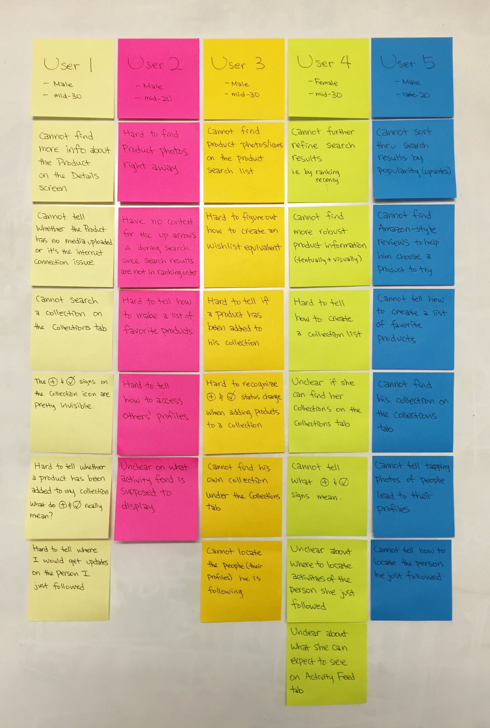
First, I listed all the pain points of each user.
Most users I tested are all working in the tech industry, but not in technical roles like engineers.
Second, I grouped the pain points by their similarity, akin to affinity mapping. Four buckets of pain points emerged. Then, I sorted them in the order of highest frequency. The tasks associated with Collections gave users the most trouble, followed by Follow/Activity, Details, and Search.
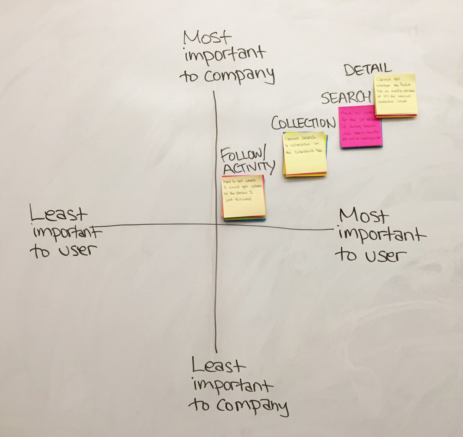
Lastly, keeping in mind the needs and goals of the persona, Jack, as well as PH’s company mission for a better product discovery experience, I mapped the four pain point buckets by their importance to users and the company. The mapping revealed that Details plays the most pivotal role in shaping users’ product discovery experience. Thus, I decided to tackle Details for this case study.
This exercise helped me prioritize which pain point to address first based on the degree of importance to both users and the company.
Key Insights on Details
All users had trouble locating enough details about a product of their choice during usability testing.
“Because I understand the upvoting process of PH, I’d go with the most upvoted product. But, once I get into the product, what I’m missing here is the robust description of what it exactly does. I think this (media) is getting close like the screenshots of what you eventually will get, but I just don’t think I’m getting the whole picture yet. I’m not ready to ‘get it’. I’m not ready to make a commitment.” — User 4
Figure 1. Screenshots of current zero data states that leave users clueless about what the product is and how it works.
There are two major problems that prevent users from learning about a product.
First, users are not successfully getting in-depth product information due to incoherent interface flow and unclear wording.
- Users are directed to comments section first when they are trying to learn more about a product.
- Users are confused by and afraid of the green Get It button, unsure of what to expect when they tap the button.
Second, a zero data or empty state leaves users clueless about what a product is about, making them not want to get the product. (Figure 1)
- Unlike the empty state for comments, the empty state for media does not provide appropriate feedback to users.
Redesign Process
The next step in my design process was ideating and visualizing possible solutions for the pain points.
Design Stories
The purpose of design stories is to imagine what users can do with the redesigned app and then break it down into digestible tasks to be done.
Design Stories helped me identify features necessary to alleviate the pain points.
Task Flow
The proposed flow places the media (description) section as the main content on a product description screen while making the comments section a related action.
I put ‘Get It’ as the end point for the task flow because getting the product indicates that users are truly discovering the product by using it, resulting in more informed opinions, comments, upvotes, shares, and so on.
UI Sketches
I started wireframing by rearranging the current screen elements and then attempted to be more creative with how the content would be presented.
Low-fidelity hand-drawn UI sketches for divergent ideation and not getting tied down to a particular idea.
As a next step, high-fidelity screens were produced. Below is a comparison of current app screens against redesigned app screens regarding the product discovery experience.
Initial Redesign Decisions
Figure 2. Product List Screens
1. Prominent photo previews instead of maker profiles on the product list (Figure 2)
- Builds upon most users’ existing mental model of using App Store.
- Helps users pick a product through progressive disclosure. The photos help users get a bit more sense of what each product is about.
Figure 3. Product Description Screens
2. Product description screen bypassing the comments section of the current app flow (Figure 3)
- Quick scroll reveals video, text, and photo information on the product, thus reducing current friction to users’ product discovery experience.
- Users can write comments while viewing the product information. This reduces their current cognitive load of having to retain the new product information while writing comments on a separate screen.
3. Changes in wording and arrangement of actionable elements (Figure 3)
- ‘Get It’ button is clarified into ‘Website’ and ‘App Store’ buttons, which stay visible at all times
- All the icons have been replaced with text buttons so that users have clear expectations on where each button would lead them to.
- The menu button has been created on top right corner to reduce visual clutter of icons and options.
Interactive Prototype
This is the demo of the initial redesign. I used this initial prototype to conduct further user testing and iterate based on the feedback. (Tool: Pixate)
Test & Iterate!
One of the most important aspects of design is getting feedback. Testing the initial prototype with more users helped me refine the design.
Key Learnings
The following feedback guided my iteration process:
- Users want to see product information right away.
- Users still find product descriptions and actionable buttons dense and visually overwhelming.
- Users are not sure which interaction to expect — scroll or swipe or something else?
Thus, the iteration process began. I initially continued iterating at a high-fidelity level on Sketch App.
First iterations started with small changes at a time.
Second Iterations focused on various interaction elements such as scroll and swipe in different sections.
When I iterated at the high-fidelity level, I kept running into designer’s block.
A breakthrough emerged when I decided to zoom out from the current iterations and go back to low-fidelity wireframe sketches.
IDEO’s design thinking course had taught me to be fluid with divergent and convergent ideation and to be divergent longer, considering all the relevant elements, before rushing to converging into a single solution. I realized I was making exactly that mistake.
I returned to sketching low-fidelity wireframes.
I focused on maximizing screen space for product information and rearranging and simplifying actionable elements.
I realized I had neglected to hyper-prioritize the elements that should be shown on the product information screen and that doing so would solve the visual clutter problem and immerse users in the product information contents.
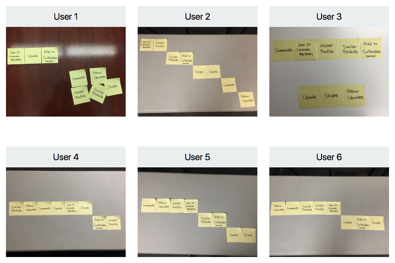
To prioritize the features, I conducted a quick card sorting exercise with 6 people to learn about what features are important to users when they try to learn about a product and potentially get it. I provided 8 post-it notes with a feature written on each and asked each participant to arrange them in the order of importance.
- 4 users were focused on social proof, prioritizing the number of upvotes, comments by others, and maker’s profile.
- 2 users disregarded social proof. They were ready to get the product after browsing the product information and deciding for themselves that they want to try it.
The card sorting results helped me sort features into primary actions to be shown on the main screen and secondary actions to be hidden.
Quick card sorting exercises for feature prioritization
With the card sorting results in mind, I proceeded to high fidelity iterations as shown below.
Final Results
Current and proposed screens — ‘Product List’ and ‘Product Details’
Screen Flow of the Prototype
With the new design, both novice and expert users can immediately learn what a product is about, visually and textually, in an immersive manner. They can also easily access important actionable elements, thus fulfilling the tasks laid out in the aforementioned design stories.
Regarding empty states, one way to improve might be having a specific format for product information. When product hunters or makers submit a product, they must upload at least one photo and few sentences that aid people’s understanding of the product. This is to prevent an empty state and make sure everyone can fully enjoy the product discovery experience on PH. An illustration is shown below. (Figure 4)
Figure 4. Suggestions on preventing empty states
Interactive Prototype
Demo video of the interactive prototype (Tool: Principle)
Next Steps
I’d love to test the redesign with more users and reiterate. There are few things I’d like to explore further.
- Collapsing the header when users scroll up but expands back when they scroll down. When collapsed, the header will only display the product name. The purpose is to increase screen real estate for the product information contents.
- Clarifying having both the name and profile pic of the maker or hunter in the header. This confuses many novice users.
- Exploring users’ mental models and reactions on the ‘Try It’ button as well as the degree of importance they assign on going to a website vs. app store of a product.


