4 Myths About Apple Design, From An Ex-Apple Designer
WHAT'S LIFE REALLY LIKE DESIGNING FOR APPLE? AN ALUM SHARES WHAT HE LEARNED DURING HIS SEVEN YEARS IN CUPERTINO.
Apple is synonymous with upper echelon design, but very little is known about the company's design process. Most of Apple’s ownemployees aren’t allowed inside Apple’s fabled design studios. So we’re left piecing together interviews, or outright speculating about how Apple does it and what it’s really like to be a designer at the company.
Enter Mark Kawano. Before founding Storehouse, Kawano was a senior designer at Apple for seven years, where he worked on Aperture and iPhoto. Later, Kawano became Apple's User Experience Evangelist, guiding third-party app iOS developers to create software that felt right on Apple's platforms. Kawano was with the company during a critical moment, as Apple released the iPhone and created the wide world of apps.

In an interview with Co.Design, Kawano spoke frankly about his time at Apple--and especially wanted to address all the myths the industry has about the company and about its people.
MYTH #1
Apple Has The Best Designers
“I think the biggest misconception is this belief that the reason Apple products turn out to be designed better, and have a better user experience, or are sexier, or whatever . . . is that they have the best design team in the world, or the best process in the world,” Kawano says. But in his role as user experience evangelist, meeting with design teams from Fortune 500 companies on a daily basis, he absorbed a deeper truth.
“It's actually the engineering culture, and the way the organization is structured to appreciate and support design. Everybody there is thinking about UX and design, not just the designers. And that’s what makes everything about the product so much better . . . much more than any individual designer or design team.”
It has often been said that good design needs to start at the top--that the CEO needs to care about design as much as the designers themselves. People often observe that Steve Jobs brought this structure to Apple. But the reason that structure works isn’t because of a top-down mandate. It’s an all around mandate. Everyone cares.

“It’s not this thing where you get some special wings or superpowers when you enter Cupertino. It’s that you now have an organization where you can spend your time designing products, instead of having to fight for your seat at the table, or get frustrated when the better design is passed over by an engineering manager who just wants to optimize for bug fixing. All of those things are what other designers at other companies have to spend a majority of their time doing. At Apple, it’s kind of expected that experience is really important."
Kawano underscores that everyone at Apple--from the engineers to the marketers--is, to some extent, thinking like a designer. In turn, HR hires employees accordingly. Much like Google hires employees that think like Googlers, Apple hires employees that truly take design into consideration in all of their decisions.
“You see companies that have poached Apple designers, and they come up with sexy interfaces or something interesting, but it doesn’t necessarily move the needle for their business or their product. That’s because all the designer did was work on an interface piece, but to have a really well-designed product in the way Steve would say, this 'holistic' thing, is everything. It’s not just the interface piece. It’s designing the right business model into it. Designing the right marketing and the copy, and the way to distribute it. All of those pieces are critical.”
MYTH #2
Apple’s Design Team Is Infinite
Facebook has hundreds of designers. Google may have 1,000 or more. But when Kawano was at Apple, its core software products were designed by a relatively small group of roughly 100 people.
“I knew every one of them by face and name,” Kawano says.
For the most part, Apple didn’t employ specialist designers. Every designer could hold their own in both creating icons and new interfaces, for instance. And thanks to the fact that Apple hires design-centric engineers, the relatively skeleton design team could rely onengineers to begin the build process on a new app interface, rather than having to initiate their own mock-up first.
Of course, this approach may be changing today.
“For Apple, having a small, really focused organization made a lot of sense when Steve was there, because so many ideas came from Steve. So having a smaller group work on some of these ideas made sense,” Kawano says. “As Apple shifted to much more of a company where there’s multiple people at the top, I think it makes sense that they’re growing the design team in interesting ways.”
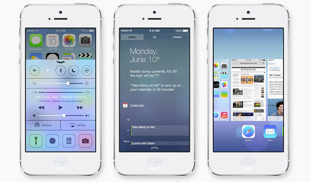
Notably, Jony Ive, who now heads usability across hardware and software, is reported to have brought in some of the marketing team to help redesign iOS 7. It's a coup, when you think about it, for marketers to be deep in the trenches with designers and engineers. (That level of collaboration is frankly unprecedented in the industry.)
MYTH #3
Apple Crafts Every Detail With Intention
Apple products are often defined by small details, especially those around interaction. Case in point: When you type a wrong password, the password box shakes in response. These kinds of details are packed with meaningful delight. They're moments that seem tough to explain logically but which make sense on a gut level.
“So many companies try to mimic this idea . . . that we need to come up with this snappy way to do X, Y, and Z. They’re designing it, and they can’t move onto the next thing until they get a killer animation or killer model of the way data is laid out,” Kawano explains. The reality? “It’s almost impossible to come up with really innovative things when you have a deadline and schedule.”

Kawano told us that Apple designers (and engineers!) will often come up with clever interactive ideas--like 3-D cube interfaces or bouncy physics-based icons--during a bit of their down time, and then they might sit on them for years before they make sense in a particular context.
“People are constantly experimenting with these little items, and because the teams all kind of know what other people have done, once a feature comes up--say we need a good way to give feedback for a password, and we don’t want to throw up this ugly dialog--then it’s about grabbing these interaction or animation concepts that have just been kind of built for fun experiments and seeing if there’s anything there, and then applying the right ones.”
But if you're imagining some giant vault of animation ideas hiding inside Apple and waiting to be discovered, you'd be wrong. The reality, Kawano explains, was far more bohemian.
“There wasn’t a formalized library, because most of the time there wasn't that much that was formalized of anything that could be stolen,” Kawano says. “It was more having a small team and knowing what people had worked on, and the culture of being comfortable sharing.”
MYTH #4
Steve Jobs’s Passion Frightened Everyone
There was a commonly shared piece of advice inside Apple--maybe you've heard it before--that a designer should always take the stairs, because if you met Steve Jobs in the elevator, he’d ask what you were up to. And one of two things would happen:
1. He’d hate it, and you might be fired. 2. He’d love it, the detail would gain his attention, and you’d lose every foreseeable night, weekend, and vacation to the project.
Kawano laughs when he tells it to me, but the conclusion he draws is more nuanced than the obvious Catch 22 punchline.

“The reality is, the people who thrived at Apple were the people who welcomed that desire and passion to learn from working with Steve, and just really were dedicated to the customer and the product. They were willing to give up their weekends and vacation time. And a lot of the people who complained that it wasn’t fair . . . they didn’t see the value of giving all that up versus trying to create the best product for the customer and then sacrificing everything personally to get there.”
“That’s where, a lot of times, he would get a bad rap, but he just wanted the best thing, and expected everyone else to want that same thing. He had trouble understanding people who didn’t want that same thing and wondered why they’d be working for him if that was the case. I think Steve had a very low tolerance for people who didn’t care about stuff. He had a very hard time understanding why people would work in these positions and not want to sacrifice everything for them.”
As for Kawano, did he ever get an amazing piece of advice, or an incredible compliment from Jobs?
“Nothing personally,” he admits, and then laughs. “The only thing that was really positive was, in the cafeteria one time, when he told me that the salmon I took looked really great, and he was going to go get that."
“He was just super accessible. I totally tried to get him to cut in front of me, but he’d never want do anything like that. That was interesting too, he was super demanding . . . but when it came to other things, he wanted to be very democratic, and to be treated like everyone else. And he was constantly struggling with those roles.”
Source: http://www.fastcodesign.com/3030923/4-myths-about-apple-design-from-an-ex-apple-designer

