Here’s a slice of a product design process—synthesizing a client’s brand and turning it into product concepts that then lead to a full visual design system.
Step 1: Brand intake
Different agencies have their own spin on this step, so this isn’t the end-all-be-all process, but what I’ve been a part of is a hybrid of the Cooper Brand Experience Workshop. Here’s a crude outline of the workshop:
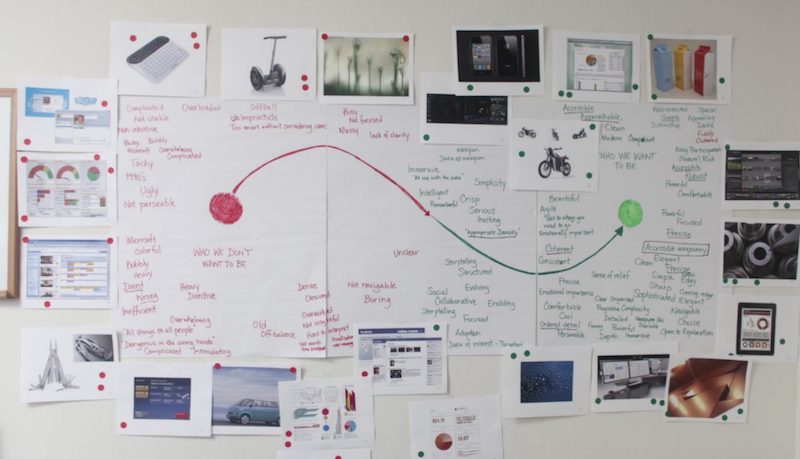
- Grab around 100 photos of different products and other things while keeping your client’s industry in mind (cars, watches, packaging, abstract shapes, data visualizations, movies, drinks, logos, celebrities, etc.)
- Tile the photos on the wall
- Allow stakeholders to react to these photos while thinking about how their brand should be experienced—they can mark positive and negative reactions with red and green stickers (this takes some coaching around subjectivity)
- Draw a spectrum, from positive to negative reactions, and hang a few key photos along the spectrum. Ones with all green dots are positive, ones with all red are negative, and mixed emotions go along the middle.
- Facilitate a discussion, and keep track of positive and negative words in green and red markers (this takes some coaching as well)
At the end of the day, you’re left with a lot of great words to synthesize from an off- to on-brand spectrum that should look something like this:
Photo credit: Cooper.
This workshop is great for gaining alignment with your stakeholders, and you can make it as fun as you want (adding some music to the voting session lightens the mood as well).
More often than not, the client will have a style guide already with some tone and voice, color, typography, imagery, and design assets predefined. But colors and typography aren’t “on brand”—they are consistency measures. It’s about how you present them that promotes or violates that brand.
Related: How to break through the limits of brand style guides
An existing style guide shouldn’t stop anyone from doing a brand intake session. Brand intakes can also vary per product, so we can’t say we know what the product will feel/look like just because our client has a style guide.
“Colors and typography aren’t ‘on brand’—they’re consistency measures.”
Step 2: Brand synthesis
What do I do with all these words?
Organize them, for a start. You’re looking for 4–5 key attributes that best describe the brand in the form of adjectives. You’re also looking for positive words that support those key attributes. And don’t throw away those negative words, they are just as important in defining something. Like measuring anti-matter by measuring the matter around it…
Organize and reorganize—sticky notes help…
Grab those key attributes
Think about the many different factors like competitive landscape, other sub-brands, master brand, brand story, target demographic, research insights, etc. The product is always more defined when these attributes create some tension with each other. When they push and pull at each other is where an interesting brand experience can lie.
Get familiar with these words. They should drive everything about the product—even the architecture should be subject to influence from these words. UX counterparts often don’t see the value in these types of workshops, so it’s the designer’s job to push this initiative early. Hopefully, if you have a nice design process paired with your UX counterpart, that influence should be easy. If you still have some waterfall in your process, that might be an uphill battle.
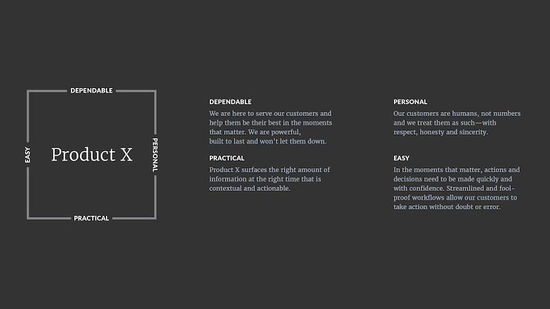
Here’s an example output:
Spectrums
Along with the attributes, I like to provide some spectrums where the product lies. This helps me quite a bit when creating a visual system and gives you a bit tighter of a line to walk. Here’s where the negative words will come in handy:
The attributes and spectrums are my first deliverable after the workshop and they provide the client with a nice buttoned-up synthesis of the product brand experience. Plus, they lay out your future visual directions with words. Make sure to get consensus on the document—the client may want to change a few words.
Besides the client’s needs, the synthesis is a great resource for the current designer on the project, as well as future designers to update the product while staying “on brand.”
Step 3: Concepts
Why do we need concepts? I thought we were aligned?
Defining the brand is like creating a box to work within. Now you know your boundaries, but you don’t know if you want to be in the center of the box, the upper left, or the bottom right. You may want to accentuate certain words and prioritize them over others. If your words are at tension with each other, you have to prioritize them over others—meaning you can’t be dead-center in the box. Creating concepts will show the client how many different roads you can go down, while still being “on brand.”
Related: Product design with the world’s best restaurants in mind
Here are 2 example concepts that push and pull on different brand attributes and use different spectrums to be defined:
Concept 1: Companion
Companion is personal, contextual, focused, fool-proof, human, and supportive.
Companion engages the user in a discussion and makes sure they know they’re making the right moves. We’re their friend who never lets them down. We can sacrifice space to make sure the user feels comfortable and focused. Animation, gestures, and emotional color choices come to the forefront.
Concept 2: Power Tool
Power Tool is dependable, practical, controllable, quick, smart, and tough.
Power Tool’s use of color is poignant, plus there’s verbiage on actions. We aren’t having a conversation with the user—we’re enabling them to take fast, optimal actions. They want to see more and do more, and we make sure every space is utilized to its full potential. Action items, controls, and processes come to the forefront.
Polarize
This is one of my favorite parts. Although these are just examples without a real brand behind them, they have some continuity and some differences. They show the same feedback screen and use the same colors and typography.
Companion is much more immersive, with a full-color background and large type and white space. The copy is more friendly and conversational. Also, this layout only surfaces one question at a time (architecture). This accentuates the personal and easy side of the brand box while sacrificing a bit of practicality.
Power Tool, on the other hand, surfaces all feedback questions on the same screen and allows the user to quickly scan the information needed to finish the flow. The layout is compact—obviously not too much, but enough to optimize efficiency. The color is used like exit lights on an airplane: action items get top priority while other elements take a back seat. Copy is straightforward, making sure no one is confused and information is quickly digestible. This accentuates the dependable and practical side of the brand box, while sacrificing a bit of personality.
Related: A unified product design workflow with Craft Sync—now for Photoshop
Neither concept is wrong, technically, and the “sacrifices” I’m prioritizing are minute. Turning words into visuals isn’t such a clear 1:1, though this process helps you get as close as possible to doing so. Instead of solving a math problem, we’re writing a persuasive essay and proving our points along the way.
At the end of the day, people have different writing styles and decide to prove arguments in different ways. What I’m trying to prove to the client here is that these attributes push and pull at each other, and when we accentuate one side, the other gets pushed back. I’m also asking them which one resinates more, because I could go either way (#notanartistatwork).
Step 4: Get the client to pick one
It’s been my experience that if you do the workshop and polarize these concepts just enough, the client will undoubtably pick one. No more of this “I don’t like either,” or, more commonly “Can you mix these 2 together?” These comments are the results of not getting aligned on the brand upfront, and not using the client’s words against them, for lack of a better term.
Step 5: Crush it!
After they’ve picked one, the rest of the design process ensues, with hopefully smoother sails and brighter days. Use those great words and chosen concept to influence color choices, type styles, photography choices, animations, interactions, gestures, illustrations, icons—and, yes, framework and content.
I believe designers should influence architecture and content decisions without stepping on toes. We aren’t UX or content experts, but throwing our hat into the discussion as the brand advocate is ideal for the product to have a successful brand experience.
Template
Here’s a brand experience template I made for a date planning app that can help you through this endeavor. Notice in this synthesis I’ve made a word cloud, spectrum, and explanation for each brand attribute. I’ve done more detailed versions and slimmer versions of a synthesis, and I think this template hits the sweet spot.
Source: https://www.invisionapp.com/blog/brand-to-interface-product-design/?utm_campaign=Weekly%20Digest&utm_source=hs_email&utm_medium=email&utm_content=52752293&_hsenc=p2ANqtz-8zhjDUy9n-6wgQCADXZ6VkgiUtRI6hmNciEawkAYqWhNEgiLCUyxqkdpogNqr7Uw_FJWGqjHXWIn__ROEcWwTEkML8_g&_hsmi=52753156


