A little change in the way Uber asks for the destination address may improve the experience for the people using the app in one of the Uber's fastest-growing regions.
I've been a huge fan of Uber since the first day I got out of the car without touching my wallet at all. I remember thinking that they must have lots of talented designers and product people, because they have nailed so much of the whole experience. However, there's this tiny detail within the app that keeps bugging me every time I use it. So I decided to give it a try and propose a solution for the problem.
What's the problem?
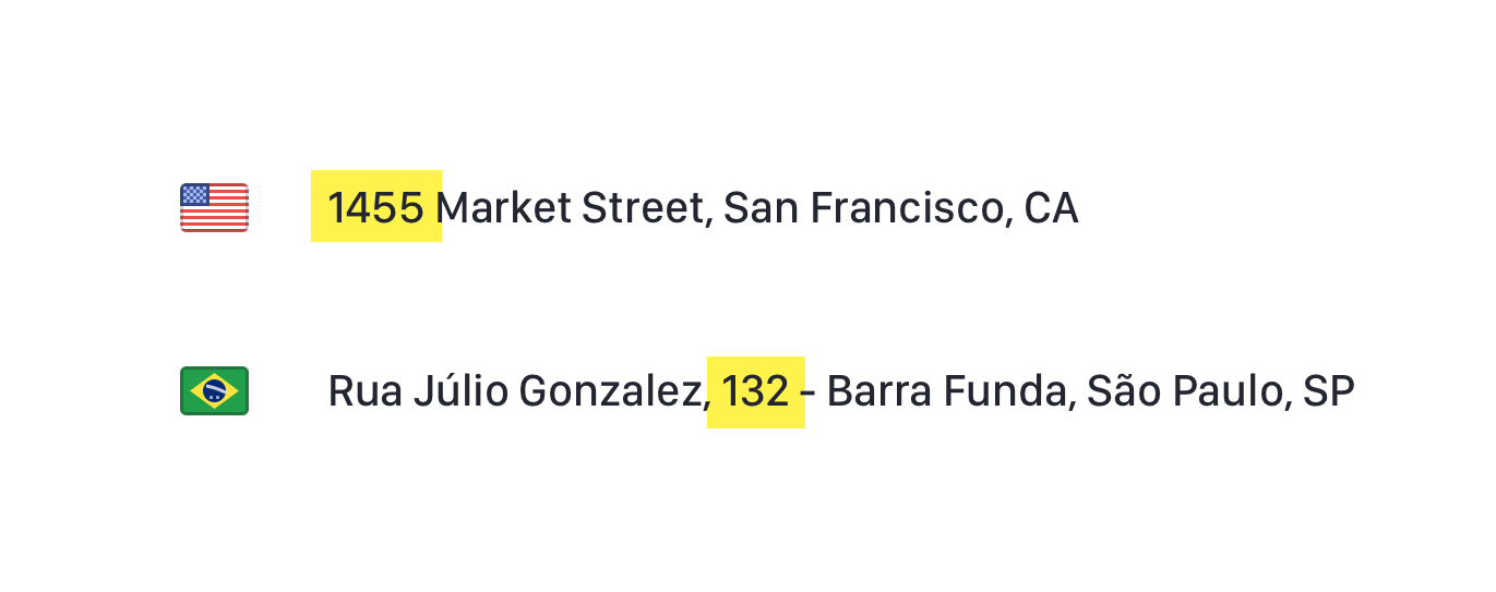
Differently from the US where the address number comes first, here in Brazil — and aparently in all Latin America — the number goes between the street name and the neighbourhood name.
As a result, when I'm typing the address and the autocomplete is shown, I have two options:
First option
- Start typing.
- First autocomplete suggestion seems right. Tap on it.
- Oh snap! The app closes the input and I didn't add the number.
- Tap on it again.
- Use the selector to place the cursor at the right place.
- Change to numerical keyboard.
- Add number.
- Yeah!
Second option
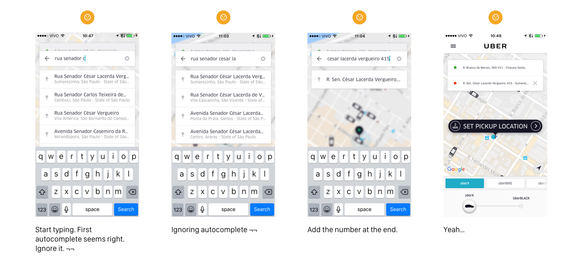
- Start typing.
- First autocomplete seems right. Ignore it. :(
- Manually complete the street name and add the number at the end.
- Yeah…
What's my proposed solution?
What if this happened:
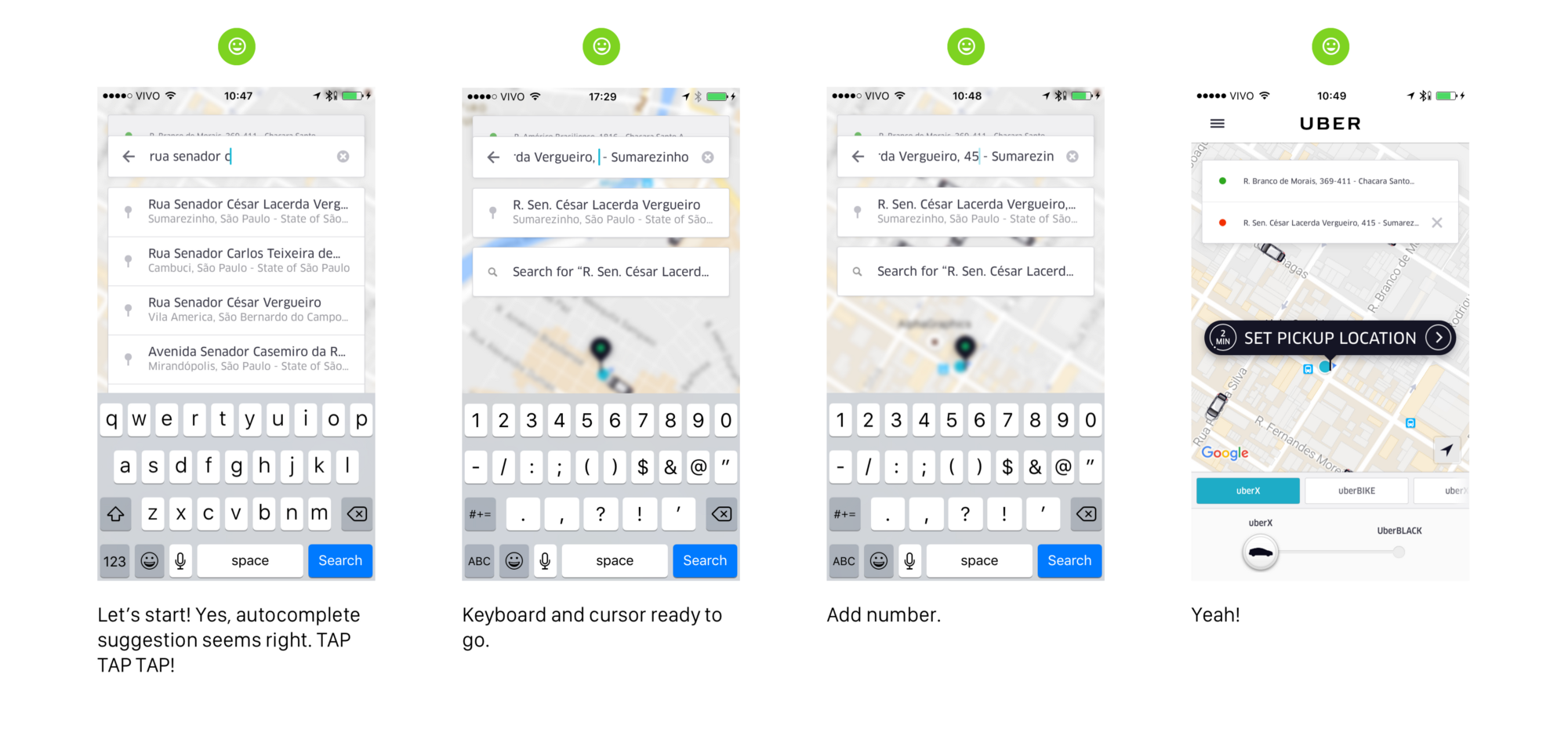
- Start typing.
- First autocomplete suggestion seems right. Tap on it.
- Address get filled. Cursor moves to the position where we should add the number.
- Keyboard automatically changes to numerical.
- Add number.
- :)
So Uber users from Brazil, is that an issue at all for you guys? Probably there are other countries whose address format is similar or even more complicated than ours. I'd be very happy to hear from you!
Finally, amazing Uber designers out there, please consider this! It'll make our experience even smoother.


