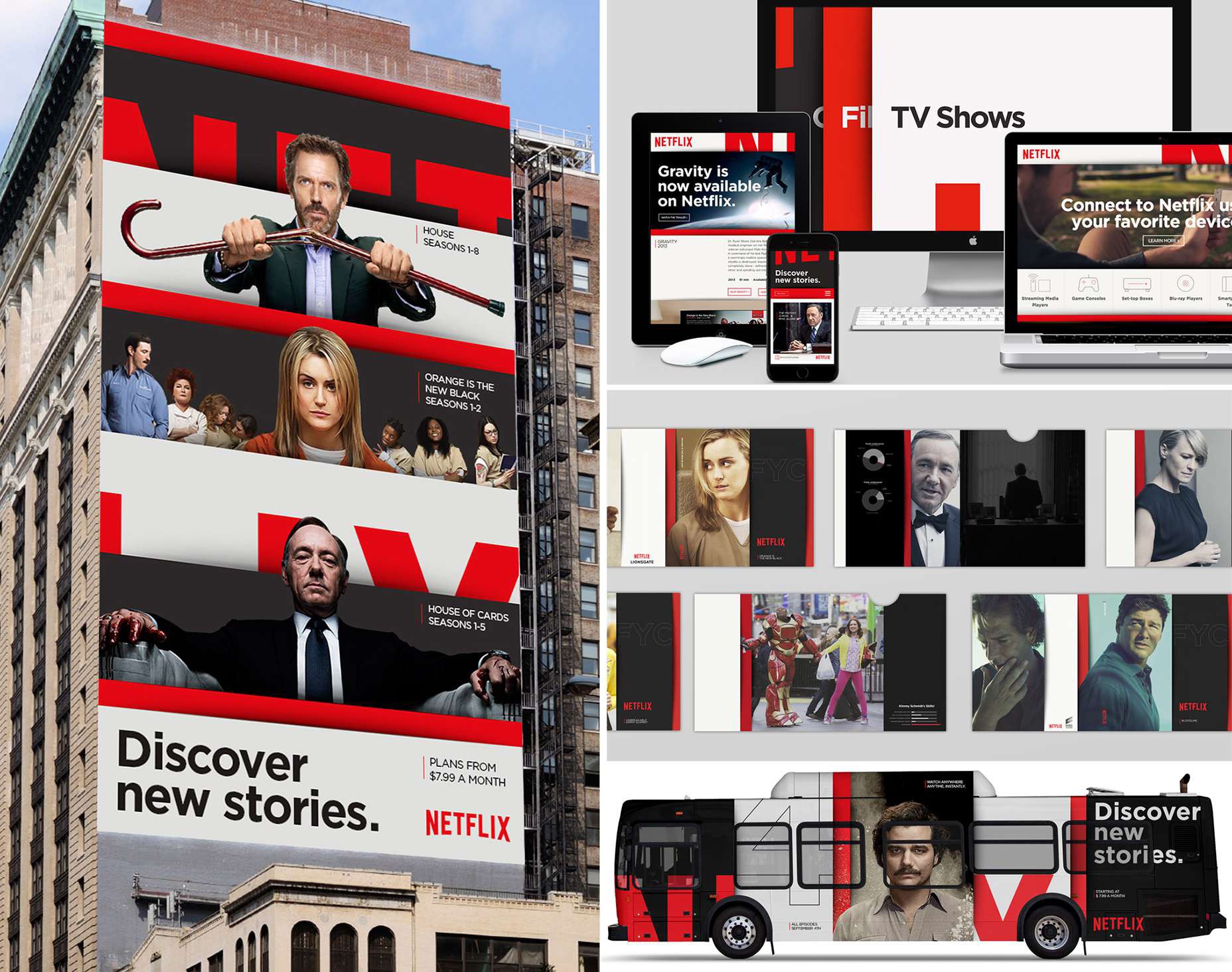
Last week, streaming media service Netflix unveiled its new identity. Designed by New York-based agency Gretel the rebrand aims to unify the company’s output across the 50 countries in which it now operates.
Our challenge was to…create something variable yet systematic and bulletproof. It had to be visually striking, adapt to any format, and hold up to interpretation by agencies and vendors around the globe. — Gretel
The resulting design, owes a debt to card-based web design. Dubbed “The Stack”, the design features 3 cards: an image card, a color card (usually Netflix red), and a text card. The Stack is designed as a metaphor for infinite selection, and user curation.
Using the system, individual designers can select the elements they need, dialing up or down the emphasis as needed. The amount of Netflix branding included for example, is being termed by the team the “brand volume”.
What’s fascinating about Netflix’s rebrand is the way it embraces, and refines responsive design; this is responsive design beyond viewports, it’s responsive design for mobile, the web, print, social media, and of course TV.
Netflix subscribers will know that Netflix allows you to switch devices seamlessly — it is not uncommon to watch a show on your mobile whilst commuting, switch to your TV when you get home, then switch to your tablet to watch the next episode in bed. We know from studies such as Google’s 2012 Multi-screen study that users browse the web in a similar fashion, switching devices based not on task, but on their context.
Gretel’s rebrand of Netflix gives us a glimpse of how we can design for that kind of user experience:
Really it translates across all parts of branding: Language behavior. Type behavior. Motion behavior. We’re trying to create things that can speak and have signature behaviors across any medium. — Greg Hahn, Gretel
It’s no accident that the identity is a flexible system that would translate easily to a user interface — the hope is that the new brand will ultimately form the basis of Netflix’s varied UIs at some stage in the future.
Visually, the most interesting part of the design approach is the cropped logo. Many logos are used as design elements, often being cropped accordingly. The Netflix design takes the approach to the extreme and demonstrates that design assets can be heavily cropped and still retain brand integrity.
What this means for web designers is that the eternal struggle to squeeze brand assets onto mobile screens may well be unnecessary. As the Netflix rebrand shows, if the ingredients are distinct enough, we only need a glimpse of the brand to enjoy its full flavor.


