The first days
I remember the first day I joined Agorize, I asked the PM if there is a styleguide I can use in Sketch. He told me we don’t have any styleguide and only have some screens designed in Photoshop.
The problem is that we have a product with a consumer-facing side and a client-facing side, and that they were based on 2 two different front frameworks. He told me that my main mission will be to find a way to visually merge the 2 parts of the product.
I understood I will have to make a styleguide, to have one source of truth and make our product consistent, while working on new features planned in the roadmap.
Two weeks later, another designer joined the team, so we decided to quickly make a first styleguide. It looked like this:
Our first design styleguide
We used this sketch file as a template starter file, but we didn’t use symbols at this time. After some weeks working together, we started to face some problems. We had to design many features and faced many inconsistency issues as the product was becoming more complex. It was also often difficult to stay synced together, and with developers.
So we decided to take some time to find a solution to those problems and improve our workflow. We were loosing to much time doing always the same small tasks. At this time, I had heard about design systems but hadn’t worked on one.
The day we started to build the system
It was time for us to start making things. Here’s the process we followed:
Step 1: UI Inventory 🔍
We started with an UI Inventory. I searched and listed all the missing components in our style template.
Form Components To Do list sample
Step 2: Create Spreadsheet to see progress 👍🏻
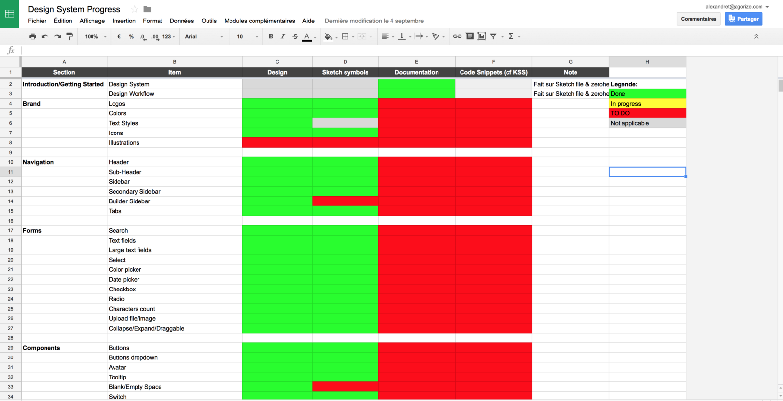
I then created a Google Spreadsheet to track progress of the different steps (design, documentation, code snippets…) for each item. Obviously, this spreadsheet has to be shared and updated.
Google Spreadsheet to keep track of the progress
Step 3: Design missing simple components ✍🏻
After that, we started to design the missing simple components. We only design atoms & molecules at this time, so we can use them once they are converted into symbols to build organisms later.
It was a long process but we finally designed almost all the components.
Step 4: Convert atoms and molecules into symbols 👌🏻
We convert only atoms, molecules and some organisms into symbols and nested symbols.
We use the plugin Auto-Layout to managed the spacing and flexibility. We now try to replace it with the new resizing feature in Sketch.
Step 5: Build organisms and page templates with symbols created 💪🏻
Trying to get that card resizable 😏
We try to make my components responsive with Auto-Layout and Sketch resizing feature, so we can reuse those components when designing for others devices or layouts.
Overrides for a symbolized card
Admin
A page template. Only for recurrent pages
Step 6: Create a shared Design Library to collaborate with other designers 👬
To share all the symbols with the other designer and create a living styleguide I can share with others teams, I first used the plugin Zeroheight.
This plugin is fantastic, it automatically generates an online styleguide with our Sketch components.
But now Sketch Libraries is out, I don’t know if we’ll keep using Zeroheight (sorry guys).
Step 7: Write documentation and best practices ✍🏻
Write documentation (specifications, guidelines, best practices…) with other designers and engineers to make sure everyone is on the same page and agreen on them.
We are currently writing our doc so I’ll edit this part in the near future.
Step 8: REPEAT 🔥
Keep building and maintaining your Design System together.
The outcome (so far)
This is how the design system looks like for now.
Preview of Agorize Design System
All artboards are organized with Atomic Design principles in mind, and by categories like Colors, Icons, Illustrations, Form components, Navigation etc…
Agorize Design System in Sketch
Form Atoms in Agorize Design System
Agorize Design System in Sketch
Icons in our auto-generated styleguide on Zeroheight.com
We still have many thing to do so keep in mind it’s a work in progress 😉
Here are the main lessons I’ve learned working on this design system:
- Don’t try to convert everything as symbols. You should only convert atoms, molecules, and some organisms.
- It’s ok to not have a perfect design system. It’s a product that is always in movement, you will always have to improve it, update it and maintain it.
- Communicate on it and involve others early in the process.
- Documentation is key. When something is written down, you can’t discuss it, you can’t make mistakes.
I’ve also learned a lot about creating products that scale, mastering Sketch tricky features and Sketch Plugins, and collaborating with engineers.


