Handling authentication is usually an afterthought, something that we just expect to work and rarely put in the effort to think it through. It should be simple, but the reality is that it comes with a lot of hassle for both the users and the company running the show. Failed logins, forgotten passwords and clunky interaction.
The login page is one of the most viewed screens of your app. Just to put things into perspective, 75% of people who have to reset their password during a checkout process, abandon it (source). In intranet portals, forgotten passwords are the #1 support requests help desks have to deal with (source). These numbers can be drastically reduced by clear language and a well thought out flow.
There are a couple of things you can consider doing to improve the authentication experience, reduce support cost and increase conversions.
Clearly stating the rules
Examples from Amazon and Ali Express
Avoid obscure rules and use clear language to explain. Don’t leave it for the validation to explain it has to be at least 6 characters long. Enforcing a minimum number of characters makes sense, but don’t over complicate. A meaningful password is more powerful than some random characters stringed together.
Show Password
Examples from Amazon
Have the option of making the password visible. This helps users logging in and signing up. Don’t ask for confirmation, use the password field toggle to help users make sure they get it right the first time. You can use an icon, a small label or a checkbox for the show/hide functionality. Amazon does this with a small twist. They keep the hidden value in the input and show the full text below, which reinforces users, lowers anxiety and communicates that the password is in fact handled with care.
Handling forgotten passwords
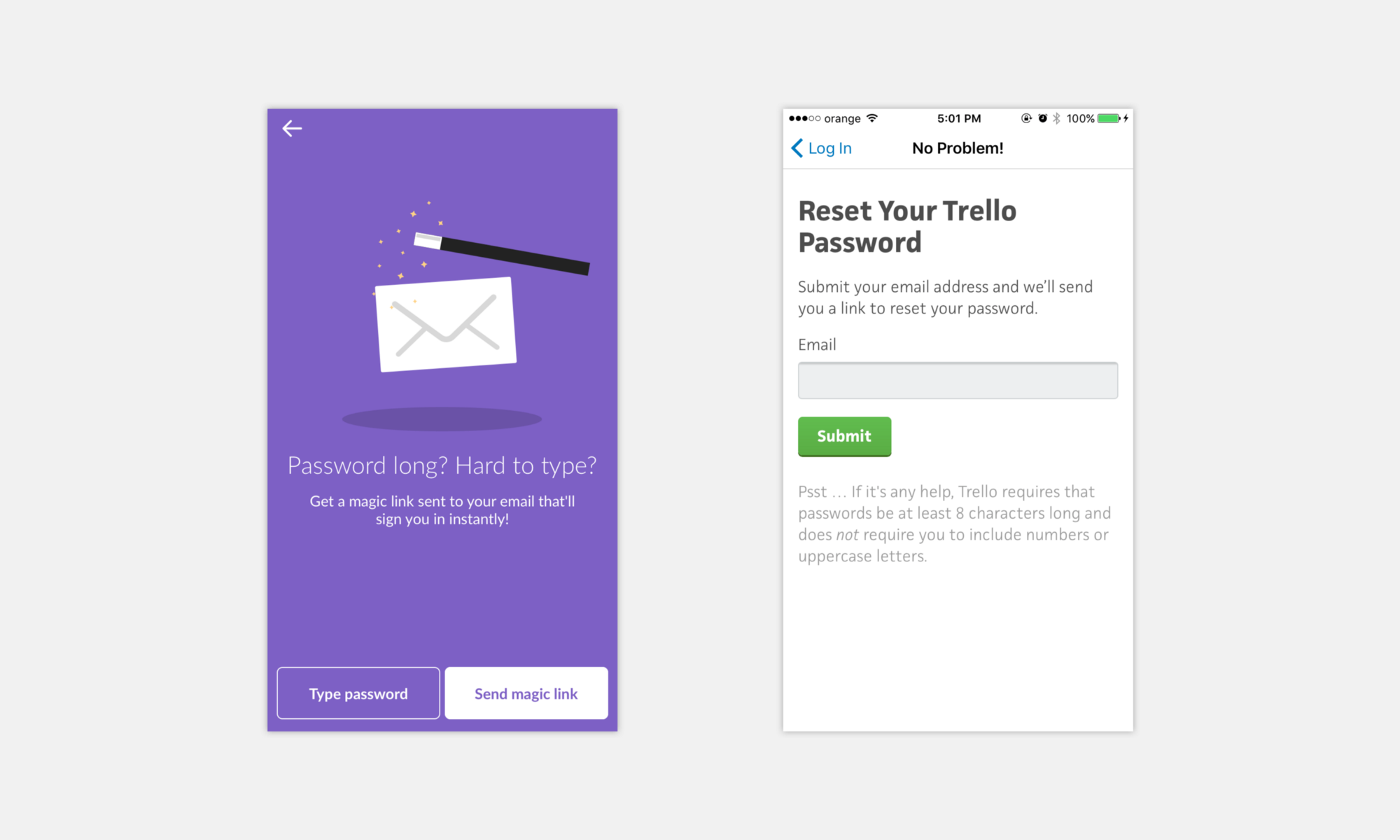
Example from Slack and Trello
Nobody likes to reset their password, it has to be done because either they cannot log in or the account might have been compromised. If you look at it like that, how can you help users to log in without the need to reset? Send a short link for logging in without the need to reset the password. Quick tip: Use microcopy to your advantage, but make sure to be consistent with your overall tone.
Passwordless entry
Examples from Medium and the App Store
Passwords are messy, so another option is to not use them at all. Either use an external authentication method, like social account login or take advantage of fingerprint readers. Think about all the times you could just confirm an App Store purchase with your thumb.
Two step authentication
Sometimes you want to add that extra layer of security. Just make sure that there is at least a reasonable timeout period before the user is asked for it again. Make it an added value, don’t bug the user just for the sake of it. Quick tip: if you want your users to enable two factor authentication, you can reward them in some way — Mailchimp gives a 10% discount to enabled accounts.
Mobile login
Examples from Mailchimp and Instagram
While most of these principles can be easily applied across a wide range of devices, mobile gives you other tools to use. If you are certain that the user is on his phone, sending an SMS or push notification with a link can be a magical thing and quickly get users where they want to be — inside the app.
PIN and Passcodes
Examples from the iOS lock screen
If you don’t need to have a full password field you can request a passcode. This should be entered with a numeric keypad.
Alternative methods for authentication
Examples from the Android lock screen
There are other ways users can be authenticated. Connect dots in a grid to draw a shape or tap certain areas of the screen.
Only require usernames if you absolutely must
If you have to rely on password entry, consider sticking with just the email address. Don’t require a username just for authentication. Even for community websites the users could be reusing their Twitter or Facebook ID.
However you do it, keep the context in mind. Ask for the bare minimum, don’t overcomplicate things and make it as painless as possible for users. Make sure to subscribe for more articles like this and check out the tools we build to help you create great web and mobile apps.


