Entertainment

Livefyre Studio Puts The Company’s Focus On User by Gavin Lau

livefyre-studio.jpg
At this point, I should probably stop calling Livefyre a commenting platform.

Actually, the company has been expanding beyond comments for a while. It launched its StreamHub product, which included more social media widgets, back in 2012. And it acquired social media curation startup Storify last year.

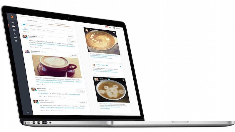
But the company is taking another big step in this direction with the relaunch of its core platform, which it’s now calling Livefyre Studio. The idea, basically, is to allow online publishers (whether they’re news organizations or brand marketers) to gather user generated content from anywhere online, and then to republish it anywhere in turn.

In some ways, it’s similar to what Storify already does, but it sounds like the aim here is to provide that kind of social media curation on a bigger scale, with more automation, and often for more marketing-centric uses. (This could also turn Livefyre into more of a competitor for startups like Chute and Percolate.)

In a quick demo, founder and CEO Jordan Kretchmer showed me how a customer could search for different types of content on Facebook, Twitter, Instagram, and across the web; hand-select the content or set up rules for automated gathering and filtering; then publish it to a customized media wall on their own site, their mobile apps, or in an ad. (The search part, by the way, is powered by Storify — Kretchmer said it’s the first integration of Storify into the main Livefyre platform.)

Livefyre Studio also includes the ability to ask users for the rights to their content, and analytics capabilities to see how these campaigns are actually performing.

The company has actually been testing the platform for months, Kretchmer said, and it went live for all customers last week. For example, it was used to create Sony’s “Greatness Awaits” page highlighting content from the PlayStation 4 community, as well as Unilever’s sustainability initiative Project Sunlight.

It can be useful for news organizations, too — Fox News took advantage of the ability to include this content in custom apps, creating an election map highlighting related tweets and Instagram photos.

But judging from our conversation, as well as Kretchmer’s blog post announcing Livefyre Studio (which does mention comments, if only very briefly), the emphasis seems to be pretty clearly on the marketing side. In fact, Kretchmer told me that in the past year brands have grown from to 0 to 30 percent of Livefyre’s revenue.

And he argued that all the user generated content posted on social media presents a big opportunity for companies to connect with consumers, both on their own sites and elsewhere, but “brands don’t have internal resources for managing this stuff.”

“We have to make it as easy as humanly possible to let brands access all of these great applications,” he added.

Introducing Livefyre Studio from Livefyre on Vimeo.

Cloth Is Where Instagram And Your Closet Collide by Gavin Lau

screenshot-2014-10-29-10-45-01.png

http://vimeo.com/108715739  

Fashion and social networking belong together, but so far no one has found the perfect balance between user-generated content and a focus on edgy fashion. That’s where Cloth comes in.

It’s a new app, launched today, that lets users share their favorite outfits in an Instagram-like feed, letting them get feedback from friends (with likes and chat) and saving their favorite outfits to remember later.

Cloth has been in beta for two years now, and today launches into public availability on the App Store. It was founded by Seth Porges, who has been a longtime journalist for organizations like Maxim magazine, Popular Mechanics, Bloomberg News and Men’s Health.

With Cloth, however, Porges shifts to a more entrepreneurial focus, looking to help people record their own best looks and share them with others.

“The goal has always been to make getting dressed easier and more fun,” said Porges. “We wanted to make an app that enhances how people are already using their phones and fashion together, without forcing them into unnatural actions that they aren’t already doing.”

Cloth not only allows you to build out a closet through photos, shared in a stream, but it also allows you to tag them so that others can search for inspiration based on specific guidelines. Plus, Cloth includes weather notifications to help you get dressed each day.

The company has raised a small undisclosed amount from a group of unnamed angel investors thus far.

Source: http://techcrunch.com/2014/10/29/cloth-is-where-instagram-and-your-closet-collide/


Feels Like Driving In The Future by Gavin Lau

Screen-Shot-2014-09-13-at-1.58.48-am.png

https://www.youtube.com/watch?v=pKL4PJICS40 We're based in the Mission District of San Francisco. Navdy was founded by entrepreneur Doug Simpson and serial inventor Karl Guttag, and is supported by a highly accomplished veteran team. In 2013 Navdy went through the acclaimed Highway 1 Incubator program and continues to work closely with Highway 1’s parent, PCH International, whose world class supply chain and manufacturing capabilities are used by companies such as Apple, Beats, and Google.

Google Unveils New Cross Platform Design Language “Material Design” by Gavin Lau

img_00141.jpg

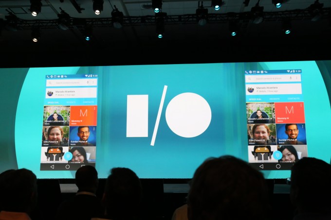
Google announced a new universal design language, called Material Design, as part of the forthcoming “L” release of Google’s Android mobile operating system. The design is meant to offer a more consistent, universal look-and-feel across mobile, tablets, desktop and “beyond,” the company explains.

“We imagined… what if pixels didn’t just have color, but also depth? What if there was a material that could change its texture? This lead us to something we call ‘material design,” says Matias Durate, Director of Android operating system User Experience at Google, during the keynote this morning.

Some of the key features of the new design include an updated version of the system font, Roboto, as well as bold and dramatic colors and highly polished animations.

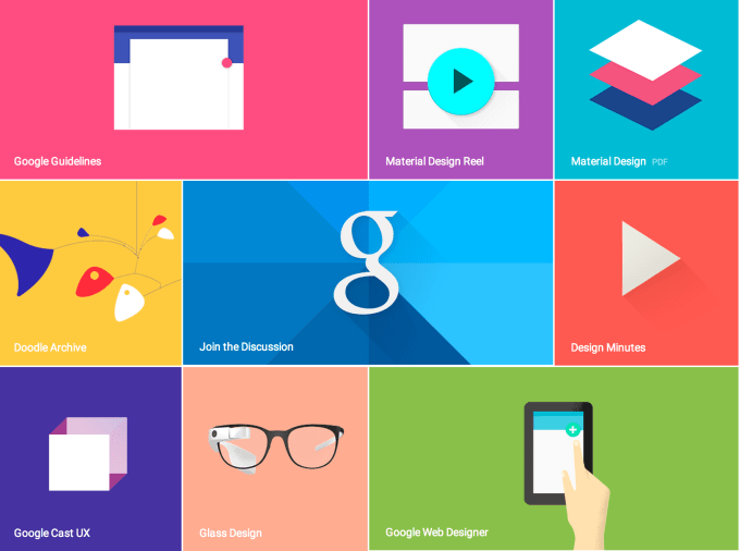
Durate also quickly walked through the changes in the new framework, which it’s also releasing publicly today at google.com/design. The idea is to put this framework in the hands of developers who build on Google’s platforms, so all apps have a consistent look, similar to how Apple has its own design guidelines for Mac and iOS developers.

The company is also introducing new redesigned versions of Google’s flagship apps using this new language, including Gmail and Calendar, for both Android and the web. You may recall reading about these changes recently, when some blogsgot a hold of leaked versions of screenshots showing Gmail’s redesign, featuring a cleaner and simpler interface.

On Android, the new look is called “Material,” and it supports a variety of new animation capabilities, has built-in realtime UI shadows, and “hero” elements that can be passed from screen-to-screen.

IMG_0020

The open-sourced framework Polymer, which highlighted during the last Google I/O, was also mentioned as being a way for developers to create building blocks which work with this new design language. Polymer offers a prototyping tool that lets you build responsive websites using predefined, customizable building blocks, and was recently discussed as being a part of Google’s forthcoming design changes we covered here when it was known as its internal codename “Quantum Paper.”

googledesign

On the Google Design website, the company references its goals for Material Design as follows:

  • Create a visual language that synthesizes classic principles of good design with the innovation and possibility of technology and science.
  • Develop a single underlying system that allows for a unified experience across platforms and device sizes. Mobile precepts are fundamental, but touch, voice, mouse, and keyboard are all first-class input methods.

Google describes the new design as being “inspired by the study of paper and ink, yet technologically advanced and open to imagination and magic.”

The design uses familiar tactile means of interacting with its many parts, with visual cues that are grounded in reality, Google says. Its elements also recall print-based design typography, with “deliberate color choices, edge-to-edge imagery, large-scale typography, and intentional white space create a bold and graphic interface that immerses the user in the experience.”

Motion is another key element of the design, but is meant to be. “Motion is meaningful and appropriate, serving to focus attention and maintain continuity,” Google adds.

More broadly speaking, the design refresh is about making the experience of using Google’s products and services, including Android, more enjoyable for end users. Apple is well-known for having stricter design guidelines for its developer partners, and that has helped shaped how consumers perceive Apple — that is, as being a design-focused company.

Now Google is stepping up to show that it’s ready to compete on design, as well.

The move comes at a time when Apple is also moving into areas Google dominates – like cloud services. That has worried Google, sources say, since it seemed like Apple was getting better at infrastructure than Google was getting at design. Material Design is Google’s effort to change that.

http://youtu.be/Q8TXgCzxEnw

Source:  http://techcrunch.com/2014/06/25/google-unveils-new-cross-platform-design-language-material-design/?utm_campaign=fb&ncid=fb

Algoriddim’s Djay App Gives iOS DJs Access To Millions Of Tracks by Gavin Lau

djay_reloop_beatpad_03.jpg

Algoriddim is updating its iOS app djay today with a big new feature — integration with Spotify.

This is the first time djay (which the company says has been downloaded 10 million times, making it the world’s bestselling DJ app) has been connected to a streaming music service. This means users will no longer be limited to the music in their collection, and can instead access 20 million tracks in Spotify’s library.

Algoriddim aims to serve both casual users and serious DJs, and on the serious side, this could be the next step away from having to lug crates of vinyl records from club to club. It sounds like an obvious move, but CEO Karim Morsy said there were significant technical challenges, because users aren’t just streaming music from the cloud, but also mixing and applying effects in real-time.

You can see the app in action in the video above — as I watched Morsy show off djay’s different features, the app seemed to work as quickly with Spotify tracks as it did with iTunes music that was stored locally.

In addition to giving djay users access to more songs (they can search or browse different playlists, as well as share playlists of their own), Morsy said the integration allows Algoriddim to introduce two new features. First, there’s Match, which recommends songs that would be the right fit to play after the current track. Morsy’s a DJ himself and he said he’d previously believed that making this kind of song selection could never be automated. But using technology from Spotify’s acquisition of The Echo Nest convinced him that he was wrong.

And users can take that automated approach even further with Automix Radio, which won’t just choose the next song, but will create an entire mix and handle all of the transitions. So you can select a song that sets the mood, then let Automix continue playing automatically. In some ways it’s similar to just creating a station on an Internet radio service like Pandora, but with “beatmatched, DJ-style” transitions between songs.

Users will need a Spotify Premium account to access the Spotify library in djay, but the app includes a 7-day free trial for the premium service. Algoriddim is also promoting the apps by cutting the iPad price in half, to $4.99, and making its iPhone app available for free.

Source: http://techcrunch.com/2014/05/22/algoriddim-djay-spotify-integration/

Former Googlers Launch Osmo, A Gaming Device That Combines Real-World Play With The iPad by Gavin Lau

osmo.jpg

A number of companies have attempted to combine physical objects and the iPad in an effort to create new kinds of children’s games, whether that’s Crayola with their DigiTools coloring pens or games that teach toddlers their shapes, like Tiggly. Today, another digital toymaker, Tangible Play, is entering this space with the launch of a series of high-quality games designed for children ages 6 to 12, including puzzles, word games, and other forms of creative play.

In development for over a year, we first spotted Tangible Play demonstrating its games at a previous TechCrunch Disrupt Startup Alley.

The company was founded by ex-Googlers, including Pramod Sharma, who had earlier seen the intersection of physical and digital when he helped build Google’s book-scanning machine, and Jérôme Scholler, who had worked on Chrome for Android.

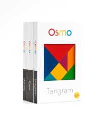
box-3pack-osmoBoth men are also dads, and like most parents, they have mixed feelings about the way today’s tablet computers engage kids’ attention. On the one hand, technologists generally like to see their kids embracing digital tools at young ages.
But, says Sharma, “[my daughter] could literally spend hours just looking at a screen, and doing nothing else. And as a parent, this is obviously concerning,” he says. That led the founders to create Osmo, the company’s first product built to combine social and creative play with the highly engaging tablet their kids were addicted to.

The games center around a technology which they refer to as “Reflective Artificial Intelligence.” What that means is that the Osmo gaming kit includes a uniquely designed reflective camera that snaps onto the top of the iPad, allowing the app to “see” the shapes and objects placed in front of the tablet on the tablet or other flat surface.

The game kit also includes an iPad stand and two physical games, their app counterparts, as well as third app that’s Osmo’s most recent addition.

IMG_0105

While the best way to experience Osmo is to try it for yourself, the general gist of the experience involves playing a game in front of the iPad, following software prompts along the way which guide the gameplay.

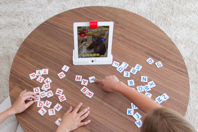
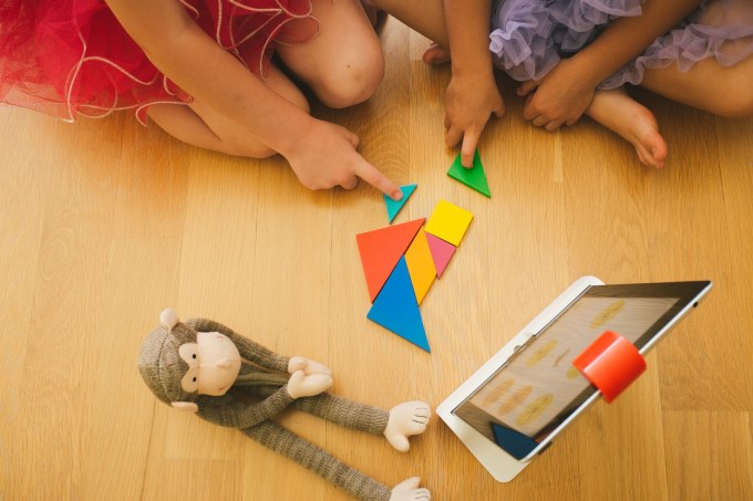
In the case of “Words,” children try to quickly guess the word by sliding letter tiles in front of the tablet, while in “Tangram” kids use colorful wooden pieces to try to reproduce the image on the screen by placing shapes together. A third title, “Newton,” lets you engage in more creative play by placing any object in front the iPad – glasses, a pen, your hands, etc. – to turn them into structures inside a game involving bouncing balls and targets.

Though my daughter is only four, and below the target age range for these apps, with some guidance we were able to play some of the Osmo games together. It was easy to see how these games could make the iPad a more social activity - something that’s more like the modern-day equivalent to what was once the family board game night at home.

http://youtu.be/CbwIJMz9PAQ

That being said, the test versions I was able to try (admittedly a few weeks behind the versions of the apps launching today) did have some kinks. I found, for example, that the shapes game “Tangram” would sometimes not see the pieces correctly, lighting up to show a match, then dimming again for no apparent reason, then lighting up again, which was confusing.

The sounds effects and music also need work, as they didn’t seem quite as kid-friendly and engaging as they could be. (They actually sound better in the video above, than in person). But overall, the games work as advertised, provided you have good lighting and a flat surface to play them upon. And Sharma says that now the goal is to make Osmo work on any surface, including floors and tables alike.

osmo2

The company has been piloting the games in over one hundred schools, many near their home base of Palo Alto. From these early tests, the founders came to better understand the potential for Osmo from an educator’s perspective, explaining that their group play nature could help with a child’s social and emotional learning, while other games taught different concepts, like spatial intelligence and creative thinking.

Crowdfunding Launch

Today, Tangible Play is launching its crowdfunding campaign which will allow it to assemble a core group of early adopters who the team hopes will help to evangelize the product and help Osmo gain traction. Though the gaming kit will eventually retail for $99, crowdfunding backers will be able to get it for a discount at $49, with some limited availability. The goal is to raise $50,000 to help with start-up and manufacturing costs.

However, the company doesn’t really need the crowdfunding in order to get the device to manufacturing, as they’ve previously raised an undisclosed round of seed funding from K-9 Ventures last year.

You can join the new crowdfunding campaign or learn more here: www.playosmo.com.

Source: http://techcrunch.com/2014/05/22/former-googlers-launch-osmo-a-gaming-device-that-combines-real-world-play-with-the-ipad/

Apple CarPlay hands-on by Gavin Lau

Screen-Shot-2014-03-10-at-23.13.40.png

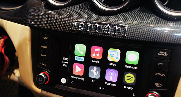
Apple's in-car infotainment system has been a long time coming. After it was announced at the company's annual WWDC conference in June last year, "iOS in the Car" flew under the radar, only to undergo a rebrand and launch publicly yesterday under a new moniker: CarPlay. Sharing part of its name with the company's AirPlay media-streaming protocol, CarPlay combines all of the iPhone's most important features and mirrors them inside the car, allowing car owners to call, text, navigate and listen to music (and more) using touch- or Siri-based voice inputs. The new in-car interface is compatible with new Ferrari, Mercedes and Volvo models unveiled at the Geneva Auto Show, and it's there that we got the chance to test Apple's automotive assistant inside a suitably equipped Ferrari FF coupe. Will CarPlay force you to buy an iPhone to go with your car (or vice versa)? Not really -- the Ferrari we tried actually deployed Apple's dash system alongside its own, while Mercedes-Benz and Volvo (two of Apple's other partners) have said they'll continue todevelop Android and MirrorLink solutions for their new models. Compatible with the iPhone 5 and up, CarPlay is "loaded" into the Ferrari's built-in navigation system by way of a Lightning adapter located underneath the armrest. Wireless connections are coming, at least from Volvo, but our test was limited to traditional cables. Once it's connected, Ferrari will continue to utilize its own infotainment system, but users can load CarPlay by hitting a dedicated dashboard button, allowing all touch and voice inputs to be diverted to your iPhone. This loads the CarPlay dashboard, which features a familiar array of icons and services you'll recognize from your iPhone. From here, it's a case of using the touchscreen or calling upon Siri to load each of the services -- the latter of which can be summoned with the Siri Eyes Free button located on the reverse of the steering wheel.

The first thing we noticed is how speedy everything is. Apps load quickly, and Siri's contextual algorithms hastily recognized our voice commands and responded appropriately. Apple has also implemented safety features to ensure services do not draw your attention away from the road and push forward its "hands-free" theme. For example, when we sent or received a message from a contact, Siri would only read the message back to us and we never once got the chance to see its contents. An Apple representative was able to talk us through each CarPlay feature, so do make sure you check out our in-depth hands-on video above to get a better idea of what Apple and its car maker buddies are aiming for.


Source: http://engt.co/1gOId5x

Smartwatch Apple or Google needs to make by Gavin Lau

Screen-Shot-2014-03-08-at-0.45.50.png

Why can't great smartwatches look like normal watches? Smartwatches, for the most part, can be divided into two categories: vague approximations of the future like the Pebble, Gear, and Gear Fit, or conventionally styled watches from companies like Citizen and Cookoo that offer far less functionality. While it's true the Pebble Steel is making inroads in the aesthetic department, its blocky construction and oversized buttons aren't likely to appeal to the masses.

Gábor Balogh is a freelance designer from Hungary who, like many of us, wants an attractive, watch-like watch that just happens to be smart. The difference between Balogh and the rest of us is he went ahead and designed an interface he believes could enable regular watch designs to include a full bevy of smart features.

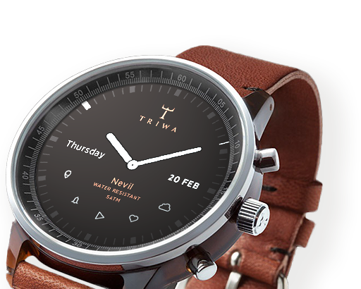
After posting his concept for a smartwatch on Behance, Balogh took some time to talk through his interface ideas withThe Verge. The actual watch pictured in the mockups is almost incidental, as the concept simply takes the Swedish watchmaker Triwa's Havana timepiece (with the company's permission) and replaces its face with a circular display. This proposal is about interface paradigms, not product design. "In this concept the UI does not have a predefined style," says Balogh, "but it would match the housing. Only the navigational patterns have to be taken into consideration."

Although the interface itself will be down to watch and phone companies to decide, Balogh offers up some simple but polished ideas that go very well with Triwa's design. Pairing your smartphone to its watch will make the appropriate app icons appear on the display, with notifications, maps, and music information streamed from the device itself. When you don't want it to be a smartwatch, it mostly looks and behaves like a regular watch.

"I LIKE PRODUCTS WITH DISCREET TECHNOLOGY."

02

"I like products with discreet technology," explains Balogh, "when they serve me, my real needs, and make my life easier rather than simply changing my days." He calls out the Nest thermostat and Apple's Airport Express as prime examples of technology being applied discretely without obscuring functionality. "They're just ticking away in the background, making your life easier."

In an attempt to avoid obfuscation, Balogh's concept doesn't utilize a touchscreen or voice control. Instead, the interface uses the buttons and bezel found on most watches. The bezel is key to this interface. It can rotate to, for example, scroll through a long message or switch functions in an app, or be clicked to make a selection. The rotation element doesn't necessarily need to be physical — Balogh says he could imagine a more classical watch going with a physical dial, or a sporty design opting for an iPod-esque click wheel.

Using the bezel for controlling apps and other smartphone-related tasks frees up the three side-mounted buttons to control "native" functions like time, date, and alarms, as well as switching between modes. This clear separation of native and app functions should make the interface easily accessible to users familiar with how a regular watch works, while the lack of a touchscreen will stop the display from picking up smudges and grime from your fingers, and also stop your fingers from obscuring the display. "The size of the watch is a very limiting factor, so we don't have to make it very smart. I see the watch as a piece of jewelry, and wanted to add an interface that would be familiar on a classic watch."

Of course, Balogh is a designer, not an engineer, and there are technological issues that will need to be overcome before we can hope to wear something like his concept on our wrists. Circular screens, although not impossible, are a rarity, and squeezing a battery and the necessary circuitry into the tiny space that usually contains mechanical watchworks would be difficult. That said, the guts of a Pebble are actually fairly small, and larger watches may be able to contain them.

As a busy freelance designer, it's unlikely Balogh will be able to muster the time or funds to assemble a team and make his concept a reality. But as technology advances it's easy to see a future where tech giants like Samsung rein in their "futuristic" designs and attempt to take on the Breitlings and Tag Hauers of the world with something like Balogh's idea.

Source: http://vrge.co/1lENsu8

Apple CarPlay by Gavin Lau

Screen-Shot-2014-03-04-at-0.50.45.png

Apple CarPlay Apple’s CarPlay is close to being available in the wild via partnerships with a handful of car manufacturers, and Volvo is already showing off what that will look like in practice. The car maker just posted a video to their YouTube account that provides a glimpse at how the system works.

CarPlay will work with a variety of different kinds of infotainment systems, including those with touchscreens, as displayed in the video, and those that use physical controls. Volvo’s integration also allows them to control features and services using steering wheel-mounted controls, and the first vehicle to sport the interface will be the XC90 SCUV, which is coming to market later this year.

Volvo offers up some interesting technical tidbits about how CarPlay works, too. The connection works via H.264 video streaming, that then gathers touch input from the console screen and relays it back to the connected device. The name ‘CarPlay’ is evocative of Apple’s AirPlay, and it sounds like the tech is similar in some ways between the two.

One final detail shared by Volvo in its press release: while currently CarPlay requires a physical Lightning cable connection, Volvo says Wi-Fi connectivity is coming in the “near future.” That could potentially open up access to devices like the iPhone 4S, which is still on sale but which uses a 30-pin connector, but Apple’s CarPlay site clearly states iPhone 5 and newer required for use, so it’s more likely this will just provide another connectivity option for owners of those devices.


Source: http://techcrunch.com/2014/03/03/volvo-shows-apple-carplay-in-new-video-says-wi-fi-connectivity-is-coming-soon

Pacemaker and Spotify cue up the iPad's simplest DJ app by Gavin Lau

Screen-Shot-2014-02-05-at-12.00.07-am.png

Jonas Norberg built two great products that nobody used. The first was the award-winning Pacemaker, a wonderfully nerdy beatmaking gadget that cost $850. The second was a tablet app for DJing, but Norberg chose the wrong partner to launch with — the BlackBerry Playbook. After being booted out of his own company and then buying it back, Norberg is trying once again to make a dent in the world — but this time, he picked a better partner: Spotify. Pacemaker for iPad, a new DJ app, launches today with exclusive access to Spotify's massive streaming music library, and the ability to play two Spotify songs simultaneously for the first time.

Pacemaker is a free app entering a crowded market of premium DJ apps like Djay and Traktor. Most of these apps use clever touch interfaces and a laundry list of features to appease both pros and amateurs, but Pacemaker takes a different approach. "We want to do for music what FiftyThree did for drawing on the iPad," Norberg says. What he means is that anyone can pick up Pacemaker and use it, without having any prior DJ skills, and without needing to own a giant library of hot tracks to mix. If you plug in your Spotify credentials (or sign up for a free trial inside the app), you're instantly granted access to Spotify's 20 million-track library of songs.

I was nervous when Norberg handed over his iPad and asked me to play it, having no prior experience, but after a few minutes of tapping around I felt pretty comfortable scratching, adding loops, and setting cues in my mix. Pacemaker’s unique radial interface finds an excellent balance between simplicity and feature bloat, offering up to eight effects like Bass and Treble, as well as a few beat pads for looping and beat-skipping. Each of these effects and adjustments are operated the exact same way — using the spin of your finger on a circle, just like with the original Pacemaker gadget. Its color palette is friendly and inviting, while its Sync button made sure my tracks never stuttered when I switched between them. The app even manages a few power-user features of its own, like a memory that records cue points you’ve set up in your most-used tracks.

As I played around with the app, I quickly realized that it wasn’t really competing with the likes of Traktor and Djay, the two industry leaders for tablet DJ software. Pacemaker was instead offering up a new kind of DJing experience that most people could have fun with without getting tripped up in settings menus and synthesizers. Traktor and Djay offer an outstanding array of features, but to an amateur like myself, they can be stifling and sometimes overwhelming. Half the battle is also amassing a big library of great tracks — another problem that Pacemaker solves with its Spotify partnership.


PACEMAKER FOR IPAD SCREENSHOTS

Pacemaker worked directly with Spotify on its integration, which includes a number of tweaks to make playback and streaming as smooth as possible. Perhaps most importantly, Spotify allows Pacemaker to stream two tracks simultaneously — a first for Spotify. In my tests, songs loaded from Spotify as quickly as they did from local storage, and were just as responsive. You can’t, however, record mixes that include Spotify tracks for licensing reasons. This is pretty much what I would expect, but it’s a shame that Pacemaker didn’t work out some way to save your Spotify mixes — perhaps by requiring an internet connection for you to play them.

"DEMOCRATIZING DJING WAS SOMETHING WE’VE ALWAYS BEEN STRIVING FOR."

The app is reminiscent of iPhone mixer Figure in its approachability, and with the addition of Spotify integration and no price tag, Pacemaker is an easy recommendation to anyone interested in DJing. Pacemaker, like FiftyThree’s Paper, offers a set of effects to start you off, but also offers an array of upgrades in a "try before you buy" store that’s a near carbon copy of FiftyThree’s. But as with Paper, you can do a whole lot without buying any of the extra effects the app offers for $1.99 each, like Reverb, Roll, Echo, Loop, and Hi-Lo, and Beatskip. I wasn’t entirely sure what all of these effects did to my music, but they were all fun to play with — and thanks to the app’s consistent interface, it was easy to mess around with any of them and feel cool doing it. "Democratizing DJing was something we’ve always been striving for," says Norberg. "We have a free app that’s really easy to get into — and now the final barrier is removed by having Spotify integration."


Source: http://vrge.co/1fJ3vSS 


Smart Tennis Sensor by Gavin Lau

Screen-Shot-2014-01-21-at-12.32.11-am.png

Sony showed off a prototype tennis racket sensor at CES 2014 that promised to track useful data about your technique and transmit it to your smartphone. That prototype has turned into reality faster than we thought it might — the final product now has a name, a price, and a release date for Japan...  

http://vrge.co/1iefefI

Introducing a brand new way to play music by Gavin Lau

bang-olufsen-ces-2014-1.jpg

Bang & Olufsen is aiming to take the music you listen to on a smartphone and put it on the wall. The BeoSound Essence is a hockey puck-shaped music controller that reduces the number of actions you need to perform to one: just tap, and the music will start playing. What music, you ask? That depends on what you were playing last. The dial on the wall is just the first part of the product. The second part is a hideaway box that is wired to your speakers and communicates wirelessly with music sources. Those sources can be smartphones, tablets or PCs — anything with Wi-Fi connection. The Essence is compatible with Apple AirPlay, Spotify Connect and standard DLNA connections.

7 Minute Workout' App by Gavin Lau

Gym_App.jpg

Last month, Apple offered a free holiday playlist through the Apple Store app for iPhone. This month, in the same manner, it's offering the 7 Minute Workout Challenge app for free, effectively encouraging users to "jump into the new year."  

http://mashable.com/2014/01/11/7-minute-workout-challenge-app-free/#:eyJzIjoidCIsImkiOiJfY28xbmQybjNnN2QzMXluNXZncDNwMl8ifQ

Tiny cube camera by Gavin Lau

Screen-Shot-2014-01-07-at-10.43.42-pm.png

Polaroid's Socialmatic isn't the only surprise to come from the faded photo brand at this year's CES. The company also showed off a line of four action cameras, including an adorable new 35-mm cube camera called the C3. It will ship for $99 later this summer. For its small size, the camera is packed full of a surprising degree of features, including a 120-degree wide-angle lens capable of capturing HD video in 1280 x 720 and 640 x 580 resolution, and still images up to 5 megapixels. It's waterproof up to 2 meters (6.6 feet), and contains 2MB of internal storage, and a micro SD slot expandable up to 32 GB. It also has a microphone and an LED light. http://vrge.co/K0kLao

4 Reasons Why Apple’s iBeacon Is About to Disrupt Interaction Design by Gavin Lau

ibeacon660.jpg

You step inside Walmart and your shopping list is transformed into a personalized map, showing you the deals that’ll appeal to you most. You pause in front of a concert poster on the street, pull out your phone, and you’re greeted with an option to buy tickets with a single tap. You go to your local watering hole, have a round of drinks, and just leave, having paid—and tipped!—with Uber-like ease. Welcome to the world of iBeacon.  

http://www.wired.com/design/2013/12/4-use-cases-for-ibeacon-the-most-exciting-tech-you

The world's most elegant physical activity monitor by Gavin Lau

misfit-shine-620x350.jpeg

The Misfit Shine is, in a word, gorgeous, like a sci-fi movie prop from a Minority Report future. It’s clear that many people want to exercise and look good at the same time- witness high-end yoga pants and other accessories. But most folks are resigned to a dongle, a hunk of plastic or an unappealing watch, because they are simple and effective and easy to understand. The disc-shaped Shine upends these conventions, and is certainly the most stylish activity monitor that we’ve seen. http://www.misfitwearables.com

Game on MOGA! iOS 7 compatible game controller by Gavin Lau

ace-power-1.jpg

MOGA have been making gamepad accessories for Android devices for a while. Today, they have announced on their website an adapted version compatible with iPhone and iPod touch. The company is the first to officially announce availability of an accessory that works with iOS 7′s GameController API... Read more at http://9to5mac.com/2013/11/19/game-on-moga-officially-announces-its-ios-7-compatible-game-controller-available-tomorrow/#xgM588WhiLKyRc1v.99