Startups

MOCAheart Makes Keeping Track Of Your Heart’s by Gavin Lau

mocaheart.jpg

MOCAheart wants to make keeping track of your cardiovascular health as easy as pressing a button. The device, which is currently on Kickstarter, was developed by a team led by Naama Stauber and Dr. Daniel Hong, who was a physician at National Taiwan University Hospital, one of the country’s top teaching hospitals, before becoming an entrepreneur. The two met while attending the Design for Service Innovation Program at the Stanford Graduate School of Business, which focuses on developing new software and hardware for healthcare.

To use MOCAheart, you place your index fingers on top of the device and wait a few seconds for your health data to show up on the connected app.
mocaheartapp

The lightweight but sturdy MOCAheart, which I saw demoed at MOCA’s Taipei office, contains several sensors within its stainless steel and plastic case. Two are light sensors: one red light and one infrared sensor that measure blood oxygen and blood velocity, respectively. Two EKG sensors track cardiac electronic activity. It also has a G-sensor, or accelerometer, so the MOCAheart can be used as an activity tracker in the future. The app uses pulse transit time (PTT) to estimate the user’s blood pressure.

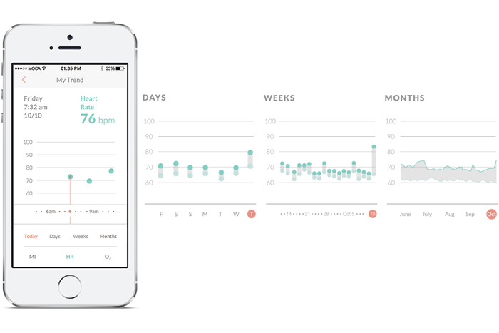
Instead of telling you your systolic and diastolic pressure measurements, like a blood pressure monitor does, MOCAheart uses a rating scale it calls the MOCA Index, which ranks your heart health (based on blood pressure, blood oxygen, and blood velocity) from 0 to 4. If you score a 0 to 1, that means your blood pressure is probably in the low to ideal range. Two means it is still normal but elevated, while 3 and 4 signify that it may be high enough to warrant a trip to the doctor.

The app also lets you note the time, location, and weather conditions for each reading. The latter is important because very cold weather or high temperatures can put people who have heart disease at risk for heart failure.

Hong says that the MOCAheart app uses its own index instead of giving people their blood pressure measurements because the device currently isn’t FDA-approved as a blood pressure monitor (though the startup might apply in the future). This is a potential drawback for people who need exact measurements, but on the other hand, if you just want an overview of your heart’s vital signs, the MOCA Index is easy to use and understand. The app does give you more precise measurements about your pulse and blood oxygen levels, and can be accessed by caregivers or family members.

The MOCAheart is targeted toward people, including the elderly, who need to keep track of their heart’s health, but can’t remember (or be bothered) to strap themselves into a blood pressure cuff everyday. MOCAheart can be slipped into a keychain holder or clicked into a specially designed smartphone case. Other cuffless blood pressure monitors out there include Viatom’s Checkme and Sotera Wireless’s ViSi Mobile monitor. MOCAheart wants to differentiate with the device’s sleek design and its app, which gives family members a quick way to monitor their love one’s health.

The device was developed partly with people like Hong’s parents in mind.

“When I was in the U.S., I’d call my parents and ask about their health. They kept insisting they were okay, even though my father actually had high blood pressure. Then he had a stroke. As a doctor, I felt I should have known earlier,” says Hong. “I wanted to create something that would make it easy for people to share track health data and share it with their families, so they can be alerted earlier if something needs to be checked out.”

MOCAheart has reached about a third of its $100,000 goal, which it needs to hit by Dec. 25. The device starts at $119 and is estimated to ship in April, a delivery date Hong is confident MOCA will be able to hit because they already have a final working prototype and manufacturers lined up in Taiwan. For more information about MOCAheart, visit its Kickstarter page.

Source:  http://techcrunch.com/2014/11/27/mocaheart/

Feels Like Driving In The Future by Gavin Lau

Screen-Shot-2014-09-13-at-1.58.48-am.png

https://www.youtube.com/watch?v=pKL4PJICS40 We're based in the Mission District of San Francisco. Navdy was founded by entrepreneur Doug Simpson and serial inventor Karl Guttag, and is supported by a highly accomplished veteran team. In 2013 Navdy went through the acclaimed Highway 1 Incubator program and continues to work closely with Highway 1’s parent, PCH International, whose world class supply chain and manufacturing capabilities are used by companies such as Apple, Beats, and Google.

Share Little Photos That Disappear In 24 Hours by Gavin Lau

screen-shot-2014-09-11-at-1-43-51-pm.png

Digg, Milk, and Revision3 founder Kevin Rose recently left Google Ventures to start a new mobile development house called North, and now we have some details on the firm’s first app, Tiiny, which will launch soon. The basic idea is that Tiiny lets you share thumbnail-sized photos and animated GIFs to a grid of pics on your friends’ phones, and they disappear 24 hours later. Rather than making you scroll through full-width photos like Instagram, Tiiny lets you get a constantly-updated look at what lots of your friends are up to in a single glance.
Rose told TechCrunch founder Michael Arrington that the app is currently going through the iOS App Store approval process and should launch very soon. Rose’s team said he’s not ready to talk more about the app just yet, but we’ll have more details on TechCrunch when it’s time.

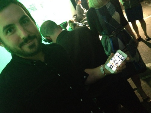
I did get a quick look at the app yesterday, though, and it’s slick. As you can sort of make out from the photo below, the top of the screen features a 3-wide by 4-tall grid of photos and animated GIFS, with a button to capture and share more at the bottom. Seeing all the moving images on the same screen made the app feel vibrant and alive, which could make it addictive to check compared to more static apps like Instagram or even Vine, which only shows one video at a time. Rather than a replacement or direct competitor to other more public broadcast and direct messaging photo apps, Tiiny seems like it could fit in as a complement.

There’s also supposedly some more functionality but we’ll have to wait until it’s out for that.

photo__2_-2

North, which we profiled last month, has a peculiar strategy. Rather than languish on building one app, North is trying to use a small team of about 3 people to launch a new mobile app every three months. This scheme lets North quickly throw apps against the wall and see what’s sticky for users. With building social apps being likened to capturing “lightning in a bottle”, this diversified approach means North won’t spend a year building something no one wants. If Tiiny is a flop, the team will just move on to the next app.

Lean UX: Getting out of the deliverables business by Gavin Lau

Screen-Shot-2014-07-17-at-10.40.41-pm.png

http://uxlx.23video.com/video/7867094  

In this talk your team will learn:

- How user experience and interaction design evolve in an agile, continuous world

- Why creating a cross-functional design process increases the viability and success of your products

- How to focus your teams on creating digital experiences instead of documentation 


Speaker: Jeff Gothelf

Designers have long relied on heavy documentation to communicate their vision for products and experiences. As technology has evolved to offer more complex and intricate interactions, the deliverables we've been creating have followed suit. Ultimately though, these deliverables have come to serve as bottlenecks to the creation process and as the beginning of the negotiation process with our team mates -- a starting point for conversation on what could get built and launched.

Lean UX aims to open up the user experience design process with a collaborative approach that involves the entire team. It's a hypothesis-based design approach that tests design ideas early and often and, along the way, builds a shared understanding with our team mates that eliminates the dependencies on heavy documentation and challenging communications. Lean UX is a solution for the challenge of Agile and UX integration while it also works effectively in traditional waterfall and other hybrid environments.


Notifyr Is A Nifty Little App... by Gavin Lau

notifyr.jpg

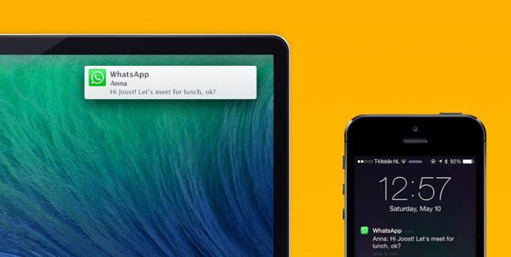
Notifyr lets you receive iOS notifications on your Mac. When I work, I put my iPhone on the table next to my Mac. Every time it buzzes, I look away from my screen to see whether it’s an important notification. I get quite a lot of notifications, and most of the time it’s not important. But it can become problematic if I’m trying to focus and write a long post. I know it’s a first world problem, but Notifyr just solved it.

When I first discovered this new app on Product Hunt yesterday, I immediately installed it. Using Notifyr works a lot like using a Pebble, except that your notifications appear on your Mac instead of on your phone.

First, you need to install the iOS app from the App Store (it costs $3.99), and the free Mac app. When you open the app on your phone, it’ll ask to use Bluetooth. On your Mac, the app will runs as System Preferences pane. You activate Bluetooth on your Mac, pair your iPhone and you’re done.

The app uses Bluetooth Low Energy, which means that it won’t be compatible with iPhone 4 or below. But it also means that it won’t drain your battery too quickly.

Now, every time my phone buzzes, I receive an OS X notification in the corner of my screen. I can also see all my previous iPhone notifications in the Notification Center on my Mac. If you receive the same notifications on your phone and Mac, for example if you have two separate Twitter clients on your laptop and iPhone, you can exclude this particular iPhone app from Notifyr.

It’s really simple, and the setup process is quite easy. Now, I could have solved this problem another way. Maybe I should try to switch off my phone from time to time. Maybe I should work on my attention span so that I don’t stop writing mid-sentence to

Source: http://techcrunch.com/2014/05/22/notifyr-is-a-nifty-little-app-that-sends-your-iphone-notifications-to-your-mac/

Tinitell Is A Wearable Phone And GPS Tracker For Kids by Gavin Lau

screen-shot-2014-04-30-at-1-40-16-pm.png
Wearables continue to be an area of focus for device makers, large and small. Here’s another would-be entrant to the space: Tinitell is a wearable phone and GPS tracker for kids, with electronics small enough for the whole device to be strapped to a toddler’s wrist.

It’s the work of a Swedish startup, founded last year, which has taken to Kickstarter to raise $100,000 to turn its prototype into a shipping commercial product by April next year. At the time of writing they are just shy of $30,000 pledged, with 29 days left of the campaign to run.

As well as being small, Tinitell is designed for basic operation. This connected wearable doesn’t have a screen on the device itself, with just a hardware button to activate the interface, and voice recognition to summon a particular contact.

Say ‘Mum’ and it will call the assigned number based on that pre-recorded voice label. There is also a way to cycle through contacts manually, using physical volume keys, and wait until the device has spoken the name of the contact you want to call.

The voice interface is based on matching what’s being said to pre-recorded name labels, rather than being fully fledged voice recognition software — which helps keep the processing power requirements down.

Contacts are added to the device via Tinitell’s website or via an app. This also allows for parents to manage who can contact their child’s device, and also locate it on a map should they need to.

Tinitell takes a 2G GSM SIM for connectivity, to power the voice calls and GPS tracking. It’s battery powered, and apparently good for an hour’s talk time on a single charge or seven days on standby. It’s also water resistant and sandbox proof, to ensure it’s robust enough for outdoor child’s play.

“I came up with the idea for Tinitell when I was hanging out with a friend who is also a father,” says founder Mats Horn. “His son wanted to go outside and play, but he didn’t have a cell phone. He had lost a cell phone once before, and we didn’t feel like lending out our smartphones. Worst of all, we couldn’t join him outside because we were busy cooking dinner. His son ended up playing in his room with his iPad, and I thought that was sad.

“I loved being outside when I was a kid… This led me to think there should be a simple mobile phone for kids, nothing advanced, just a nicely designed speaker and microphone to handle quick ‘hellos’ and ‘come heres’.”

Horn argues that market for a simple mobile for kids is “largely untapped” — although it must be said that there are a lot of kids phones already out there. But the wearable aspect of Tinitell gives it the advantage of being harder for the child to lose than a phone. It’s also arguably less obtrusive than other GPS tracker systems for parents to keep tabs on kids, such as Locca. Whether those are big enough advantages to get parents flocking to buy Tinitell remains to be seen.

Wearable devices are certainly going through a sort of Cambrian Explosion of incarnations at present, as companies try to figure out the use cases and form factors that stick. (On the not-going-to-stick front, I’m pretty sure you can write off the ridiculously unwieldy Rufus Cuff, for one.)

Tinitell’s bet is there is space for dedicated connected kids’ wearables. And they are not the only startup to think so — the Moff Bluetooth bangle is a wearable toy that augments the gestures of play with sound effects. There’s also the Guardian Bluetooth Low Energy-powered tracker wristband, also designed specifically for parents to keep tabs on kids.

Cost is likely to be a key factor in whether these kids’ wearables flourish or perish. Tinitell is being offered to early Kickstarter backers starting from $99 — rising to $149 once early pledge levels are claimed. So it’s not exactly cheap.

Tinitell’s Horn says he’s been funding development on the device through private stipends and loans, thus far. The startup also won Sweden’s largest entrepreneurship competition in 2013.

http://youtu.be/r1mW1S4ZJWc


Colorbay is a new way of looking at photo-sharing platforms by Gavin Lau

colorbay-main.jpg

Colorbay is a beautiful iOS app that lets you browse images from popular photo-sharing sites like Instagram, 500px, and Flickr. If you are a longtime user of these services, Colorbay is also a time capsule that lets you rediscover old favorites. For example, Instagram only shows the last 300 photos you’ve liked because the service wants to make sure it “runs smoothly as the app becomes available to a growing number of people.”

That might seem like a lot, but over the past three years, I’ve liked way more than 300 photos on Instagram, including pics of my friends’ children as they grow up and images from design-related accounts that I save for inspiration.

I have even more old favorites on Flickr because I joined in 2004 and was an avid user. Back before Facebook became widespread, Flickr was my favorite site because there tons of very active groups for things ranging from Japanese Rement miniatures to vintage clothing.

But I’ve stopped visiting Flickr as often as I used to, partly because most of the people I met on the site have migrated to other social networks. I also disliked last year’s major redesign and Flickr’s Favorites page was never easy to navigate in the first place.

end on Pinterest or Evernote to catalog most of my favorite images, but Colorbay’s “My Likes” stream is a welcome trip down memory lane. I found photos I haven’t looked at in almost five years, but still enjoy. It’s also a fun way to browse my own old snapshots.

Colorbay, which is also available for iPads, displays photos in a mosaic-style stream that automatically plays unless you pause it. It currently allows you to browse your timelines and popular photos from 500px, Flickr, Instagram, Pixter, and App.net. Colorbay’s cool “Throwback” feature automatically delivers a random mix of photos from all services, while “Lomography” delivers film (or film-like) photos with that tag. You can also search your own tags.

Even if you don’t like to wallow in nostalgia as much as I do, Colorbay is also a fantastic photo discovery tool and a great piece of eye candy.


Source: http://techcrunch.com/2014/04/07/colorbay-is-a-new-way-of-looking-at-instagram-flickr-and-other-photo-sharing-platforms

Android and iOS users spend 32%... by Gavin Lau

flurry_time_spent_android_ios.jpg

Android and iOS users in the US spend an average of 2 hours and 42 minutes every day using apps on smartphones and tablets (up just four minutes compared to last year). Of that, 86 percent (or 2 hours and 19 minutes) is spent inside apps, while the remaining 14 percent (or 22 minutes, down 6 percentage points compared to last year) is spent on the mobile Web using a browser. These latest figures come from mobile firm Flurry, which provides analytics and ad tools that developers integrate into their apps. The company collected data between January 2014 and March 2014 and concluded that “apps, which were considered a mere fad a few years ago, are completely dominating mobile” while the browser “has become a single application swimming in a sea of apps.”

Here are the results in graph form:

Just like last year, games took first place with 32 percent of time spent. Social and messaging applications increased their share from 24 percent to 28 percent, entertainment and utility applications maintained their positions at 8 percent each, while productivity apps saw their share double from 2 percent to 4 percent.

It’s worth underlining that Facebook’s share dipped a bit from 18 percent to 17 percent. Nevertheless, Facebook still has the lion’s share of time spent in the US, and was able to maintain its position with the help of Instagram. Flurry argues that position will become even more cemented, if not increased, once the acquisition of WhatsApp closes.

This year, Flurry broke out YouTube separately, which shows us it owns a whopping 50 percent of the entertainment category. We’ll be watching closely to see if it manages to grow its 4 percent share of time spent.

“It is still too early to predict the trajectory apps will take in 2014,” Flurry admits. “But one thing is clear – apps have won and the mobile browser is taking a back seat.” Unless this trend reverses, we can expect many more acquisitions from tech companies the size of Facebook and Google.


Source: http://tnw.to/q3Jet

Smartwatch Apple or Google needs to make by Gavin Lau

Screen-Shot-2014-03-08-at-0.45.50.png

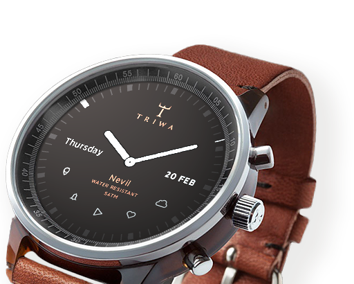
Why can't great smartwatches look like normal watches? Smartwatches, for the most part, can be divided into two categories: vague approximations of the future like the Pebble, Gear, and Gear Fit, or conventionally styled watches from companies like Citizen and Cookoo that offer far less functionality. While it's true the Pebble Steel is making inroads in the aesthetic department, its blocky construction and oversized buttons aren't likely to appeal to the masses.

Gábor Balogh is a freelance designer from Hungary who, like many of us, wants an attractive, watch-like watch that just happens to be smart. The difference between Balogh and the rest of us is he went ahead and designed an interface he believes could enable regular watch designs to include a full bevy of smart features.

After posting his concept for a smartwatch on Behance, Balogh took some time to talk through his interface ideas withThe Verge. The actual watch pictured in the mockups is almost incidental, as the concept simply takes the Swedish watchmaker Triwa's Havana timepiece (with the company's permission) and replaces its face with a circular display. This proposal is about interface paradigms, not product design. "In this concept the UI does not have a predefined style," says Balogh, "but it would match the housing. Only the navigational patterns have to be taken into consideration."

Although the interface itself will be down to watch and phone companies to decide, Balogh offers up some simple but polished ideas that go very well with Triwa's design. Pairing your smartphone to its watch will make the appropriate app icons appear on the display, with notifications, maps, and music information streamed from the device itself. When you don't want it to be a smartwatch, it mostly looks and behaves like a regular watch.

"I LIKE PRODUCTS WITH DISCREET TECHNOLOGY."

02

"I like products with discreet technology," explains Balogh, "when they serve me, my real needs, and make my life easier rather than simply changing my days." He calls out the Nest thermostat and Apple's Airport Express as prime examples of technology being applied discretely without obscuring functionality. "They're just ticking away in the background, making your life easier."

In an attempt to avoid obfuscation, Balogh's concept doesn't utilize a touchscreen or voice control. Instead, the interface uses the buttons and bezel found on most watches. The bezel is key to this interface. It can rotate to, for example, scroll through a long message or switch functions in an app, or be clicked to make a selection. The rotation element doesn't necessarily need to be physical — Balogh says he could imagine a more classical watch going with a physical dial, or a sporty design opting for an iPod-esque click wheel.

Using the bezel for controlling apps and other smartphone-related tasks frees up the three side-mounted buttons to control "native" functions like time, date, and alarms, as well as switching between modes. This clear separation of native and app functions should make the interface easily accessible to users familiar with how a regular watch works, while the lack of a touchscreen will stop the display from picking up smudges and grime from your fingers, and also stop your fingers from obscuring the display. "The size of the watch is a very limiting factor, so we don't have to make it very smart. I see the watch as a piece of jewelry, and wanted to add an interface that would be familiar on a classic watch."

Of course, Balogh is a designer, not an engineer, and there are technological issues that will need to be overcome before we can hope to wear something like his concept on our wrists. Circular screens, although not impossible, are a rarity, and squeezing a battery and the necessary circuitry into the tiny space that usually contains mechanical watchworks would be difficult. That said, the guts of a Pebble are actually fairly small, and larger watches may be able to contain them.

As a busy freelance designer, it's unlikely Balogh will be able to muster the time or funds to assemble a team and make his concept a reality. But as technology advances it's easy to see a future where tech giants like Samsung rein in their "futuristic" designs and attempt to take on the Breitlings and Tag Hauers of the world with something like Balogh's idea.

Source: http://vrge.co/1lENsu8

by Gavin Lau

screen-shot-2014-02-27-at-9-46-37-am.png

RobinHood is about to let anyone buy and sell stocks for free instead of having to pay E*Trade or Scottrade $7 per transaction. Today RobinHood begins inviting the 160,000 people who’ve signed up to download its glossy new app where you can efficiently track and trade stocks. “It’s by far the most beautiful brokerage app, though that’s not saying much” co-founder Vlad Tenev jokes. But while RobinHood makes Wall Street look stylish in your pocket, what’s special is what it does, and does for free. That’s letting you trade stocks with zero commission. You might assume it would cost RobinHood money to execute trades, but in fact it can make money by moving yours around. We’ve just been conditioned to assume its something you have to pay for after decades of investors handing Scottrade, E*Trade and other brokerages $7 to $10 for each buy or sell.

screenshot-2013-12-18-at-6-36-44-am

Those who want their trading for free can sign up for RobinHood and expect an invitation email over the next few weeks to months. Since you’re trusting it with your savings, RobinHood wants to onboard people with extreme care rather than as fast as possible. But soon it expects to be holding hundreds of millions of dollars for its users so they can make instant trades from their phones.

RobinHood gave TechCrunch the first look at its new app, and its investor Google Ventures‘ attention to design is readily apparent. The whole app is themed white or black depending on if the stock market is open or closed. Meanwhile, the app’s chrome goes green or red depending on if the currently viewed stock is up or down that day. This trick tells you at a glance whether you can officially trade or not and how well you’re are doing.

Robinhood_nightAndDay

Most finance apps only let you monitor stocks like Yahoo Finance or the first version of RobinHood, or charge you to trade them like those from the big retail brokerages. RobinHood co-founder Baiju Bhatt stresses that if you want to do deep financial research, you probably want to sit down at a desktop. But if you want to check your stocks whenever you have free moment and make some trades when the courage strikes you or whenever something shocks the market, RobinHood lets you do it in a few swipes. [Disclosure: I was friends with Vlad and Baiju in college.]

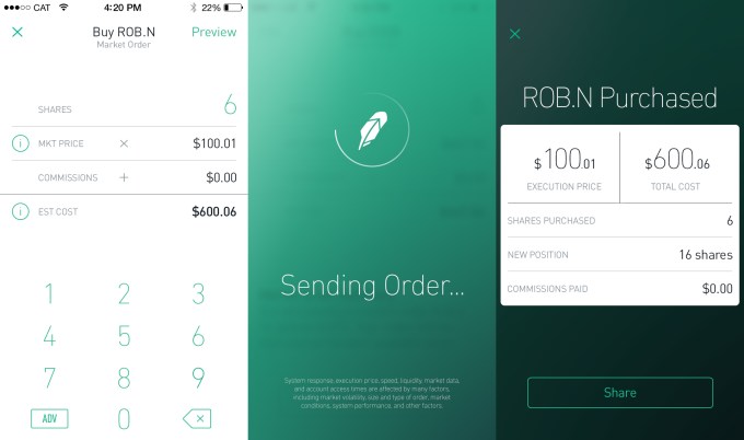
You can set alerts in case your stocks move a certain percentage, or place limit orders that are executed if the price hits a certain point. When you’re ready to make a live trade, just select how many shares of a stock you want to buy or sell. RobinHood previews how much that will cost or earn you, and you swipe to confirm the trade (which triggers some delightful animations and buzzes). And because security may be the biggest threat to RobinHood, it even lets you set up a special pin code that’s required to open the app.

Robinhood_ThreeScreens

RobinHood says it will never charge for trading. Right now, it’s supported by over $3 million in funding from Google Ventures, Index Ventures, Andreessen Horowitz, Rothenberg Ventures and some angels. But it plans to quickly become self-sustained by charging other developers for API access, letting users trade on margin (money they’re owed but don’t own yet) for a fee, and through payment for order flow where stock exchanges pay the startup to bring its trading volume to their marketplaces.

For now, though, RobinHood could democratize stock trading. If you were a fat cat trading in the hundreds of thousands or millions, those little $10 fees didn’t mean much. But if you’re not rich and still want to invest, those commissions could add up to eat away at what you earn through smart trading. By replacing brick-and-mortar store fronts and legions of salespeople with an app and a lean engineering team, RobinHood can pass the savings on to its users.


Source:  http://techcrunch.com/2014/02/27/trade-stocks-free-robinhood

Fitness Tracking Comes To Your Ankle by Gavin Lau

Screen-Shot-2014-02-21-at-11.58.25-PM.png

Fitness Tracking on Your Ankle Flyfit isn't all that different from other pedometer-based fitness trackers –– except you put it on your ankle instead of your wrist.

That's useful for swimmers and cyclists, who didn't get any joy out of the Fitbit, Nike Fuel Band or Jawbone Up. But Flyfit can measure pedal and leg stroke movements.

Flyfit, a Kickstarter project, has been in development since 2012. Like most fitness trackers, it will still record other aspects of your daily activity — your steps, your sleep cycle. It will also connect with your phone via Bluetooth, allowing the device to track pace, speed and your GPS position, all in real time.

The device includes a waterproof, USB-chargeable battery and five different band colors. The battery can last a week in low-power mode. The app, still in development, will be available for both iOS and Android.


Source: http://mashable.com/2014/02/20/flyfit-fitness-tracker/

more human, way to manage your network of contacts by Gavin Lau

Humin1-786x305.jpg

The contacts app that ships with iOS is a pretty straightforward affair that doesn’t offer much more than the handwritten address books we used to keep next to our landline phones. Humin is a new app that will be launching in beta this week that aims to be a smarter way for iPhone users to manage their contacts. Humin’s name doesn’t echo the word ‘human’ for nothing – co-founder and CEO Ankur Jain wants his startup’s product to understand relationships the way that you do. We don’t think of our network of contacts as an alphabetical list of names, our brains organise our contacts in more complex ways, but ways that make sense to us – where we met people, where they work, what they look like, who they know, and the like. Humin wants to tap into that subconscious human logic without you having to do anything differently.


http://tnw.to/stDX

Smart Tennis Sensor by Gavin Lau

Screen-Shot-2014-01-21-at-12.32.11-am.png

Sony showed off a prototype tennis racket sensor at CES 2014 that promised to track useful data about your technique and transmit it to your smartphone. That prototype has turned into reality faster than we thought it might — the final product now has a name, a price, and a release date for Japan...  

http://vrge.co/1iefefI

7 Minute Workout' App by Gavin Lau

Gym_App.jpg

Last month, Apple offered a free holiday playlist through the Apple Store app for iPhone. This month, in the same manner, it's offering the 7 Minute Workout Challenge app for free, effectively encouraging users to "jump into the new year."  

http://mashable.com/2014/01/11/7-minute-workout-challenge-app-free/#:eyJzIjoidCIsImkiOiJfY28xbmQybjNnN2QzMXluNXZncDNwMl8ifQ

iPad-mounted Structure Sensor 3D scanner by Gavin Lau

Screen-Shot-2014-01-11-at-12.49.03-am.png

Augmented reality has never been nearly as cool as its name suggests. Even when it isn't gimmicky, it's virtually useless, in large part because your mobile camera's version of "reality" is short one dimension. Scanning and computer vision company Occipital, however, wants to add real depth to your tablet's vision with the Structure Sensor, a Kickstarter- backed product that shipped to backers late last year. The $349 Structure Sensor is a Kinect-like camera that fits on the back of an iPad or, with some hacking, any other device. With the bracket on, your tablet doesn't just see objects, it can figure out how far away they are, doing anything from turning an object into a 3D model to measuring the distance of a room. http://vrge.co/1lGoBVh

iPhone case uses electromagnetic radiation to power its LED notification lights by Gavin Lau

lune-case1.jpg

The Lune case, developed by gadget startup Concepter, does just that. With no battery or power connection to your iPhone, the case can light up when you receive a call. Concepter was showing off the case at Eureka Park, the early-stage startup section of the International CES.


http://venturebeat.com/2014/01/08/this-iphone-case-uses-electromagnetic-radiation-to-power-its-led-notification-lights

The Best Calendar iPad App - Sunrise by Gavin Lau

ipad_screenshot05.png

Calendar app Sunrise released a major update today, completing two missing pieces of the complicated calendar puzzle — you can now use Sunrise on your iPad with a new design tailored for bigger screens, and there is a much-requested week view to get a better picture of what your schedule looks like. Finally, the company added background updates so that your calendar is always up to date when you open the app. “We realized that mobile is an even bigger paradigm shift than we originally thought,” co-founder and CEO Pierre Valade told me. “Every other day, I don’t even use a computer anymore — I consider the iPad as a mobile device. People want to feel productive anywhere, and work from their iPad. So that’s why we built Sunrise for the iPad.”


http://techcrunch.com/2014/01/09/sunrise-adds-ipad-app-and-week-view-in-its-quest-to-build-the-best-calendar-platform

The War For Your Wrist by Gavin Lau

smartwatches.jpg

The past decade has seen the consumer electronics war grow more furious and more personal: your living room is a battlefield, as are your desks and your pockets. Now, more than a year-and-a-half since the Pebble (née Allerta) team saw its e-Paper smartwatch concept shatter a $100,000 Kickstarter funding goal, gadget purveyors of all stripes are vying for a spot on your wrist. http://techcrunch.com/2013/12/08/the-war-for-your-wrist/?

How much does it cost to build the world’s hottest startups? by Gavin Lau

developing-apps-786x305.jpg

Could $100,000 and the right developer skills make you an overnight billionaire? How much does it really take to build a product like Twitter or Instagram? With mobile development agencies and product incubators on the rise and more corporate “labs” spinning out each day, there’s no shortage of talent to help you build the next great Web or mobile app.  

 http://thenextweb.com/dd/2013/12/02/much-cost-build-worlds-hottest-startups