Survey

Flipboard’s New App Gets Personal By Making Topics... by Gavin Lau

img_0243.jpg

Flipboard has been working hard over the last few years to build an app that makes reading stories on mobile and tablet devices as engaging as flipping through a magazine. With the latest version of its app, users will be able to find and discover content that is relevant to their interests, through the introduction of topics they can follow. Already, Flipboard has done a good job of getting — and keeping — readers’ attention. It now has more than 100 million readers who have downloaded the app, and is adding 250,000 more each day. Those readers are flipping about 8 billion pages per month, and that number continues to grow. But the new app is aimed at keeping those users engaged through personalization.

When you first open up Flipboard 3.0, the app guides you through the process of picking a series of topics you will receive updates on. It asks “What are you interested in?” and provides a wide range of suggestions that vary from high-level content based around categories like “Technology” down to more granular topics such as “iPad apps.”

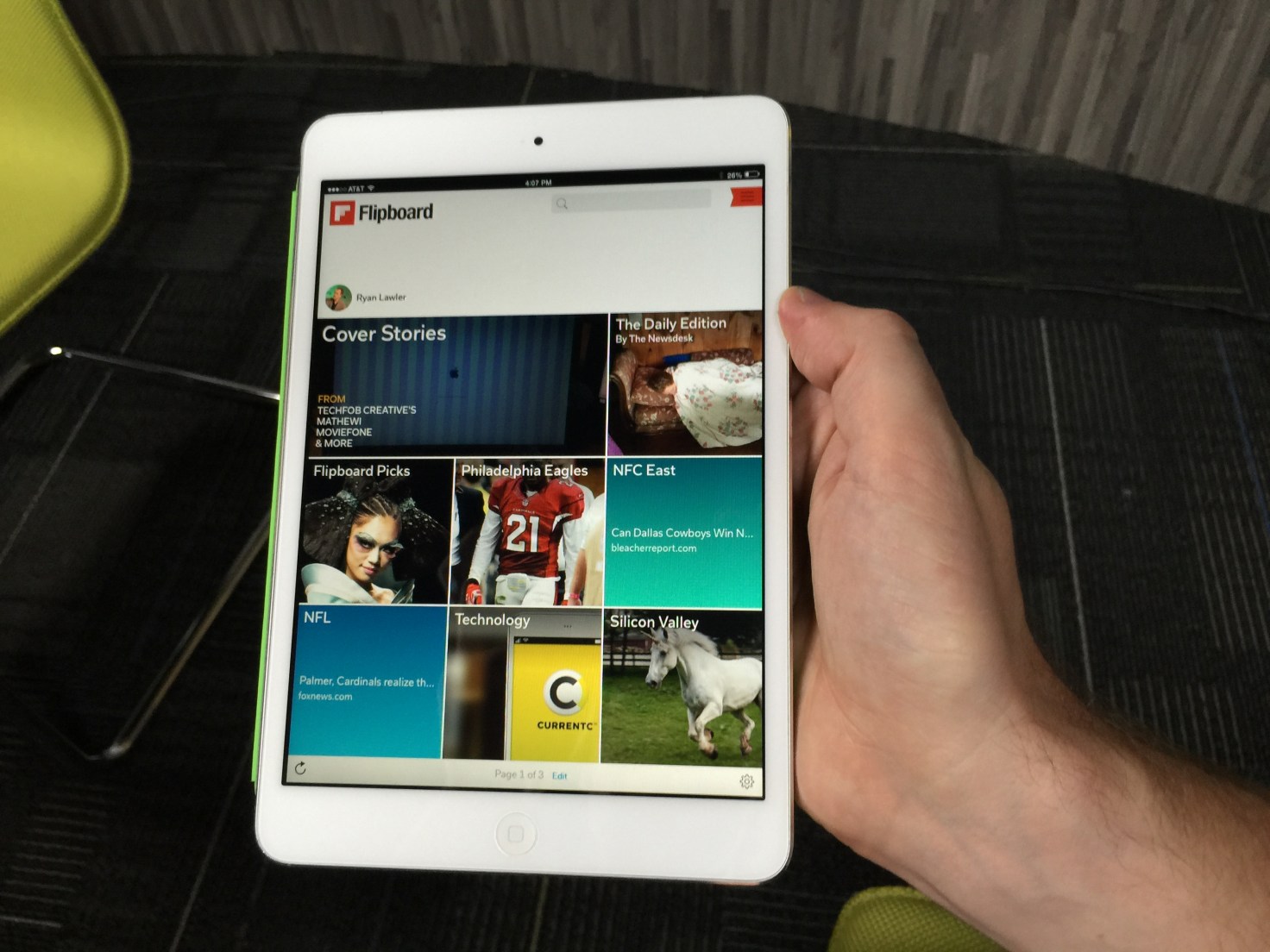
Once you’ve chosen several topics of interest, the app opens up to unveil a front page that features stories from multiple sources you can flip through. Stories are tagged by content provider as well as by topic, allowing users to drill down and see more content related to each. You can also choose to follow stories by source or by topic, which would provide even more content served up to users.

At launch, Flipboard will have more than 30,000 different topics to choose from, so there’s something for everyone. And the ability to easily add topics over time could keep casual Flipboard users keep coming back for more as the app becomes more personalized and relevant to them.

Users can click through to see which topics, people, and accounts they follow and drill down on stories shared there. Or they can search for particular topics. And even if readers are following hundreds of topics, the app will work to showcase the most relevant or interesting topics on any given day, according to Flipboard co-founder and CEO Mike McCue.

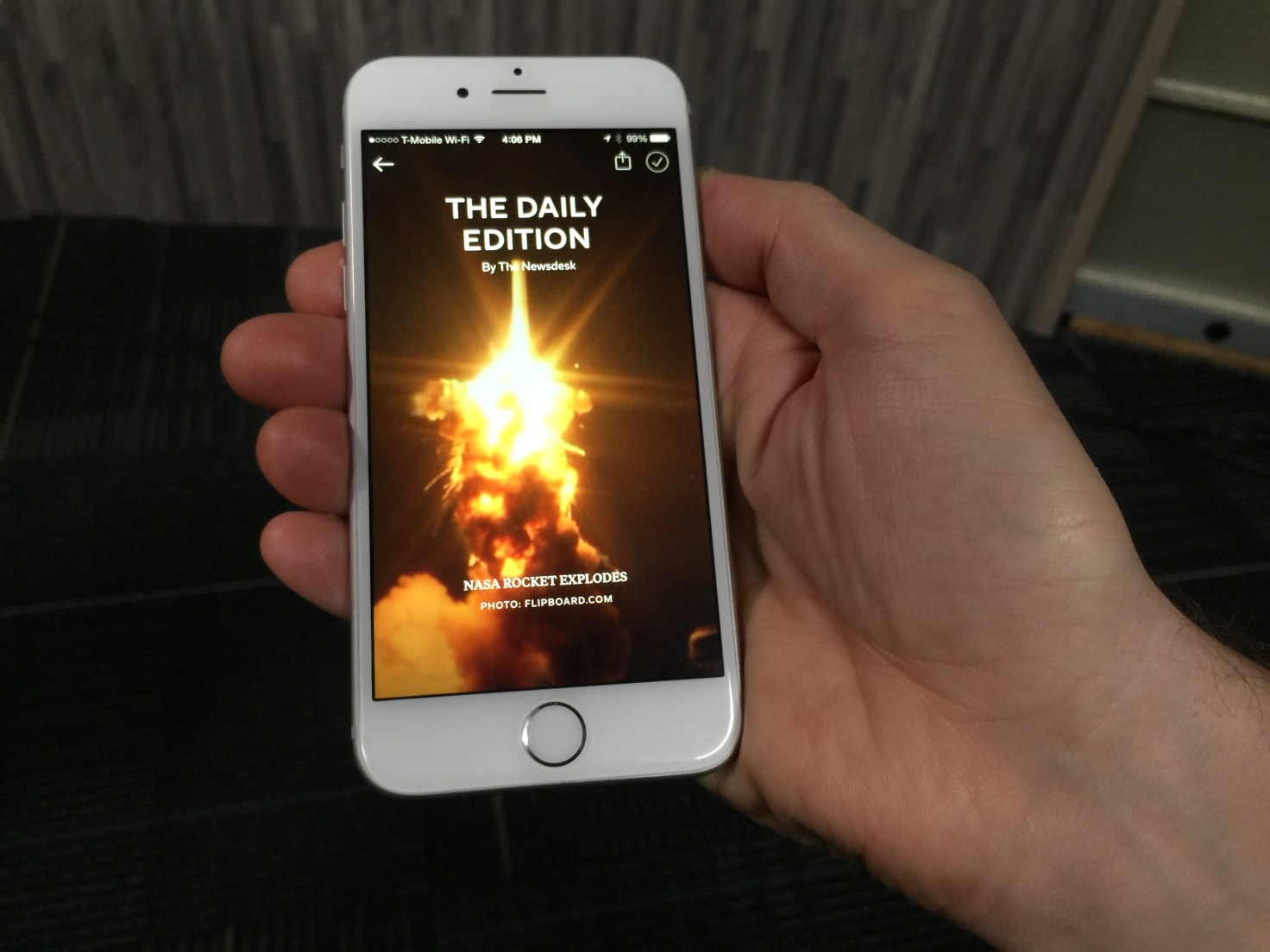
But it’s not all going to be algorithmically programmed. In addition to its topics, the app is also adding a “Daily Edition” of content that has been selected by Flipboard editors. It will be released every day at 7:00 am and will feature all the biggest news from the previous day, as well as a daily photo and “parting GIF” for readers.
IMG_0249

Moving Beyond Reader Curation

For Flipboard, the move to a topic-following model is a departure from its previous personalization efforts. Last year, the company released a big app update that enabled users to create and subscribe to virtual magazines based on their own interests. By doing so, they could curate stories from multiple different sources and present it in a unified fashion. Readers, meanwhile, benefitted by being able to subscribe to magazines created by other like-minded users to discover content they might not have seen otherwise.

Magazines have been incredibly popular on Flipboard: The company says there have been more than 10 million of them created and curated by readers since launch. They can range from having just a few followers to hundreds and thousands of followers — and the top magazines have generated tens of millions of page flips from readers.

That feature also added a new potential revenue stream by enabling brands and retailers to create shoppable magazines and catalogs of products for sale. That’s on top of advertising CPMs that are closer to print publications than digital properties.

That said, Flipboard’s magazine model wasn’t perfect. After all, it relies on readers to keep updating their magazines over time in order to keep providing fresh content to others. Furthermore, each magazine reflects the interests of the creator or creators and may not be exactly what a reader is looking for.

IMG_0247

Zite Acquisition Bears Fruit

The update is designed to improve upon the current experience with a more personalized feed, which users create by following different topics of interest to them. That ensures readers will be kept up to date on the news that’s important to them, without having to rely on another reader to curate a magazine for them.

McCue says the new version blends people-powered curation with algorithmic curation. For that, the app builds on its magazine creation tools and adds features from a couple of acquisitions Flipboard made over the last few years.

The first was its Cover Stories feature, which came about with help from technology it acquired as part of its purchase of Ellerdale several years ago. That gave Flipboard the ability to structure and display content more like a magazine.

It’s the more recent acquisition of Zite which helps to power the app’s new topic-centric following model, however. Zite was acquired from CNN earlier this year, and ever since the combined engineering teams have been working on ways to make Flipboard more personalized and more engaging.

It’s Zite’s technology that is being used to identify and categorize the topics that users can subscribe to. It can do that without its readers building magazines, which opens up a whole lot of new topics and content for readers to discover.

But that’s the whole point. Finding more relevant content is key to Flipboard’s business model, after all.

The more readers flip and the more engaged they are in its magazine-like experience, the more ads they see. The more ads they see, the more money Flipboard makes. And considering that Flipboard has raised more than $160 million since being founded, it’ll need a lot of flips to justify that funding. The good news is, whatever it’s done so far seems to be working.
IMG_0252


Source: http://techcrunch.com/2014/10/29/flipboard-3-0/

Drop your mobile marketing strategy by Gavin Lau

CLS_6181-e1409841468966-700x419.jpg

“You do not need a mobile marketing strategy for your company or a brand,” said TBWA’s head of digital Tuomas Peltoniemi, during the last session of Mobile Interactive 2014 organised byMarketing Magazine. Why?

“Because mobile is not just another addition to your marketing strategy. It needs to be much more than that. Mobile should be at the heart of every aspect of your marketing strategy. It is not just a device for brand building for businesses,” Peltoniemi (pictured) explained.

In a recent finding by Google Singapore, it was reported that 96% of consumers search local information on their mobile. Meanwhile 87% of the respondents claimed to research products via their smartphones and 44% claim to have made purchase.

No doubt, mobile is here to stay. Yet with the proliferation of platforms, it can often be overwhelming for marketers to see mobile as another medium to be understood and conquered.

Hence marketers need to see mobile as a mean to amplify the potential of their existing mediums, explained Peltoniemi.

Here’s how mobile can be integrated into the heart of any marketing strategy.

Email marketing

Have you considered how mobile impacts email campaigns? Probably not.

According to Litmus Research Email Analytics and Jacobs & Clevenger, today 49% e-mails are opened on mobile devices but 90% of e-mail newsletter or campaigns sent out today do not consider mobile. This results in nearly 80% of users deleting their e-mail that don’t fit the screen.

Yet if marketers could make tweaks to mobile optimise these e-mail campaigns, conversion rates likely to jump by 10% to 20%, explained Peltoniemi.

“Once a brand starts considering mobile not only does it optimise conversion rates but it is also tapping into something most marketers aren’t. Mobile needs to be a key part of any e–mail activity that you do,” Peltoniemi added.

Search marketing

According to Google, by December this year, mobile search on Google will most likely surpass PC search. Mobile search is also now a key decision tool with 45% of mobile search done by a consumer being goal oriented. At the same time 73% mobile search triggers additional action right away and a conversation.

However marketers need to be mindful that in a study done by The Google Mobile Playbook 57% of users say they won’t recommend a business that has a poor mobile experience. Ease of use and convenience on the search page would however draw back a consumer to head down to a brand’s website.

Website User Experience

Be it search, social media, or banner ads – at the end of the day there are a lot of trigger points marketers place to drive people to their brand websites. Here’s where user experience and responsive web design comes into play.

Responsive web design is vital and a must today. A business’s web design needs to be optimised for all devices be it mobile, PC or a tablet.

It is also important to note that today 41% of users see mobile as their primary or exclusive means of going online.

Social media marketing

Social networking is all about mobile. According to a study by Adobe late last year, 71% of people access social media through their phones. According to Facebook, 52% of content sharing is now also done through mobile and not desktop. It is thus vital how marketers customise content to fit into mobile on social media.

“When marketers run social media ads they need to be mindful that the ads are actually competing against real people’s lives. A brand’s paid massaging needs to be really relevant to people’s lives and you need to produce content that will resonate with them,” Peltoniemi added.

Barriers to mobile marketing

On the topic of optimising mobile advertising, Ashwin Malshe, assistant professor marketing at ESSEC Business School added that while Mobile and Web advertising have reinforcing effects on each other, there are three big barriers to mobile.These include:

  • Consumer behavior:

Consumers are largely inconsistent and marketers are still trying to work out a balance in how much information they can or should collect without coming off creepy, explained Malshe. He added that most consumers are still highly offended when they come across an ad which is disrupting their day. To date,  only 7% of people are willing to see an add.

  • Economic challenges:

Companies today are still struggling to figure out ROI measurement and which mediums to attribute a sale to. Proving ROI is not only a moving target in marketing, but also a major burden due to the time required to accurately report results. Globally, 75% of marketers face a problem when trying to calculate ROI and a common issue is connecting marketing activities to specific earnings generated.

These are the findings of a study by Teradata’s Data-Driven Marketing Survey 2013.

  •  Technology:

With so much data being around, 80% of the time large corporations are spending time sieving though the data. Only 20% of the time do marketers actually get to utilize the data and use it to target their audience. Meanwhile existing trust issues by consumers and internal coordination in a company are also needed to overcome the tech barrier present.

Lean UX: Getting out of the deliverables business by Gavin Lau

Screen-Shot-2014-07-17-at-10.40.41-pm.png

http://uxlx.23video.com/video/7867094  

In this talk your team will learn:

- How user experience and interaction design evolve in an agile, continuous world

- Why creating a cross-functional design process increases the viability and success of your products

- How to focus your teams on creating digital experiences instead of documentation 


Speaker: Jeff Gothelf

Designers have long relied on heavy documentation to communicate their vision for products and experiences. As technology has evolved to offer more complex and intricate interactions, the deliverables we've been creating have followed suit. Ultimately though, these deliverables have come to serve as bottlenecks to the creation process and as the beginning of the negotiation process with our team mates -- a starting point for conversation on what could get built and launched.

Lean UX aims to open up the user experience design process with a collaborative approach that involves the entire team. It's a hypothesis-based design approach that tests design ideas early and often and, along the way, builds a shared understanding with our team mates that eliminates the dependencies on heavy documentation and challenging communications. Lean UX is a solution for the challenge of Agile and UX integration while it also works effectively in traditional waterfall and other hybrid environments.


Interactive eBook Apps: The Reinvention of Reading and Interactivity by Gavin Lau

image00-691x220.jpg

The invention of the tablet PC has created a new medium for book publishing. Interactive books are everywhere, and have revolutionized the way people consume the printed word. With the recent software available to allow easy creation of interactive books and with the race to bring these products to market, there seems to be a more and more dilution of quality and a loss for the meaning of interactivity. When publishers create new eBook titles or convert a traditional printed book to a digital interactive eBook, they often miss the added value this new medium can provide.

It’s important to understand the distinction between apps and eBooks, as it's something that often confuses both publishers and consumers. It basically comes down to formats; apps are mostly native iOS orAndroid software, whereas eBooks are documents of a particular format, such as the open standards EPUB and Mobipocket (.mobi). And eBooks can be further distinguished from “enhanced eBooks,” which use formats such as ePUB3 for iBooks (Apple) and Kindle Format 8 (KF8) for Kindle Fire (Amazon).

eBooks were the first to appear on devices such as the Kindle, and have very limited interactivity. You are mainly able to flip the pages, search for content, or highlight words to see a dictionary definition. These devices also allowed font size to be increased to enable visually impaired readers enjoy books more easily. This gave publishers the unforeseen benefit of regaining a large population of users who couldn’t read printed books.

Enhanced eBooks (ePUB3) are a new digital publication standard that allows easy integration of video, audio, and interactivity. I expect this format to advance the future of textbooks and other educational material. Future textbooks might be able to "read themselves" with audio narration, perhaps preventing students from actually reading. But the benefits outweigh the downsides; for example, the new text books might also offer the ability to make and share annotations without destroying the book, interactive self-tests throughout the chapters, and generally a much more enjoyable learning experience.

Apple has recently released iBooks Author, a free eBook creation software that lets anyone with a Mac to create iBooks textbooks, cookbooks, history books, picture books, etc. iBooks Author generates a proprietary format for books that will only be available for sale on Apple devices. Adobe has also made available a Digital Publishing Suite via InDesign for the iPad, Android, and Blackberry platforms. Mag+ and Moglue are two other independent publishing platforms that are worth mentioning.

http://youtu.be/pr076C_ty_M

Interactive eBooks is a category for apps designed specifically to utilize the powers of tablets to enable users to interact with the storyline in sight, sound, and touch. I like to think of interactive eBooks as an evolution of the printed book with added interactivity in order to create an experience beyond the printed format. Examples of interactive eBooks include pop-up book apps for kids, interactive travel guides that utilize the device GPS capabilities, cookbooks with built-in timers and video recipes, or any traditional book that now uses the tablet to enhance the experience with interactivity.

Grimm's Rapunzel 3D Pop-up Book

Grimm's Rapunzel ~ 3D Interactive Pop-up Book

On a touch device, interactivity is the ability to engage with the user interface, including the ways you move your fingers on the screen, the way you to select an app, or how you browse the Web. Interactive eBooks are, by definition, an enhanced book-like experience that have a different core premise than other types of apps (with the exception of games perhaps). Whereas in most applications, interactivity focuses on menu navigation and interaction with the user interface as means to achieve a goal (view an image, find an address, read an email), interactive eBooks provide interaction with the content and storyline, and therefore offer a unique experience each time. A good example of is Richard Dawkins’ The Magic of Reality, where you interact with the storyline through interactive demonstrations and games that allow you to get hands-on with the science discussed in the book by, for example, letting you simulate the effects of heat, pressure, and gravity on different states of matter.

http://youtu.be/eBrP3-Ep3ww

The experience of interactive eBooks should not be confined to animations based on touch-and-response interaction, or merely flipping the page; when designing these Books one must ask what is the enhancedexperience—why to move from print to digital, and how to create value and fun.

Interactivity for the Sake of Interactivity

If a book app does not use interactivity in order to enhance the reading experience, it does not belong in the interactive eBook category. In the race to bring interactive books to market, some of the books have only featured very superficial interactivity—what I call “interactivity for the sake of interactivity”—where, for example, touching an image activates a simple animation such as making a butterfly fly, or a tree drop leaves to the ground. These interactive experiences do not add value to the story, and are therefore somewhat meaningless.

There are a few exceptions where this type of interactivity is actually a success. For example. one of the first books published as an interactive app for the iPad was Alice in Wonderland. This book was a phenomenal success though offered nothing but eye-candy interactivity. When the app was first published, the reviews called it "a reinvention of reading” that made clever use of the accelerometer to make Alice grow as big as a house or to throw tarts at the Queen of Hearts and watch them bounce. Although these activities through the 52 pages of the book are fun, I think they distract from the actual story. The reason this book was such a success is due its having been published when the iPad was fairly new, and touch interactivity was still an exciting experience.

http://youtu.be/gew68Qj5kxw

Another book that was fairly successful at the time was The Pedlar Lady of Gushing Cross, which offers narrated animation with very basic interactivity, but was considered revolutionary when it came out because reading the story while seeing the animation unfold was definitely an enhanced experience to the young reader. However, this book did not offer any real value through interactivity, and might as well be classified as a short animated movie. The limited interactivity of seeing letters animate while you tilt the device was merely a gimmick, as you can see in the video below

http://youtu.be/1mfm9dwLzdU

Cozmo's Day Off is an interactive eBook that was on the top-seller list for many months, and is packed with interactive elements that made it a great success. It contains over 100 unique audio and animated interactions. However, this app would be better characterized as a game for young kids and not as an interactive storybook because the story seems secondary to all the bells and whistles, and it’s written in style not intended for young audiences. But perhaps this is a case where interaction simply for the sake of interaction can be the whole point of a book.

The image below shows all of the hotspots that trigger an animation sequence for one page of the book:

Hotspots for Cozmo's Day Off

http://youtu.be/s59IzYDhz8E


Interaction for Value

It is possible for interactivity to go beyond the superficial, to add value to the book and create an experience that would be impossible in print. Here are a few examples of such cases.

Al Gore's Our Choice is a great example of how meaningful interactivity creates an engaging and fun learning experience. With clever use of interactive infographics, animations, documentary videos, and images, this book is a great example of what the future has in store for digital publishing.

http://youtu.be/U-edAGLokak

The Martha Stewart Cookies iPad app is a wonderful example of an interactive recipe book. Besides just offering great recipes, it also allows you to search recipes based on ingredients and cookie type to find the perfect cookie for your needs. For example, you might use the app’s search wheel (below) to look for bars and biscotti-type cookies with oatmeal as the main flavor component. This is a great added value because this type of interaction is unmatched in print.

Martha Stewart Cookies AppParis: DK Eyewitness is probably the most complete travel guide you can find for the iPad. It features beautiful cutaways of buildings that can be explored by tapping and zooming, complete offline maps for all the central districts of the city, interactive city and park walks with “hotspots,” and extensive listings of the best sights relative to your current location. No more searching aimlessly for your location on a map or looking through index pages; the interactive app shows what's around you within walking distance, making the iPad a must-carry on in your travel bag for an experience unparalleled in a traditional travel guides.

http://youtu.be/c3JHGVSSW9w

Bobo Explores Light is an educational experience for young adults. It puts a fully functional science museum in the palm of your hand, teaching you about lasers, telescopes, lightning, reflection, bioluminescence, and sunlight. This is great example of using simple interactivity to explain relatively complex topics through science experiments that you can actually perform on your iPad. Bobo, a friendly robot, serves as a guide, taking the young reader through space, land, and sea, to learn all about the science of light.

http://youtu.be/GBckJD0tfAo

In my book, Timor the Alligator, kids participate in the story by picking toothpaste and helping Timor brush his teeth. This story could not have been told in a printed book because, without the use of interactivity, young kids would not be able to visually understand that brushing actually helps keep a clean mouth. The simple process of choosing a toothbrush, adding toothpaste, and brushing Timor’s teeth until they turn white serves as an educational experience for preschoolers and toddlers reading the book.

http://youtu.be/H7ASZOZNd1U

With the Numberlys app, kids (and adults) learn about the alphabet through a series of fun interactive games. This book probably has the most spectacular visuals I’ve seen to date. Its aesthetic is inspired by Fritz Lang’s silent film, Metropolis, so the app offers a unique cinematic experience and gameplay to engage users to learn about the (fictitious) "origin of the alphabet."

http://youtu.be/D8soG0XgzzA

As you can see from these examples, interactive eBooks are no longer just about a touch-to-animate type of interactivity, nor simply the touch interface controls. Rather, they are about adding value through interactivity by using the full capabilities of a touch device to engage the user and enhance the learning and reading experience. These engaging experiences are what I call a true reinvention of reading.


source: http://uxmag.com/articles/interactive-ebook-apps-the-reinvention-of-reading-and-interactivity

Android and iOS users spend 32%... by Gavin Lau

flurry_time_spent_android_ios.jpg

Android and iOS users in the US spend an average of 2 hours and 42 minutes every day using apps on smartphones and tablets (up just four minutes compared to last year). Of that, 86 percent (or 2 hours and 19 minutes) is spent inside apps, while the remaining 14 percent (or 22 minutes, down 6 percentage points compared to last year) is spent on the mobile Web using a browser. These latest figures come from mobile firm Flurry, which provides analytics and ad tools that developers integrate into their apps. The company collected data between January 2014 and March 2014 and concluded that “apps, which were considered a mere fad a few years ago, are completely dominating mobile” while the browser “has become a single application swimming in a sea of apps.”

Here are the results in graph form:

Just like last year, games took first place with 32 percent of time spent. Social and messaging applications increased their share from 24 percent to 28 percent, entertainment and utility applications maintained their positions at 8 percent each, while productivity apps saw their share double from 2 percent to 4 percent.

It’s worth underlining that Facebook’s share dipped a bit from 18 percent to 17 percent. Nevertheless, Facebook still has the lion’s share of time spent in the US, and was able to maintain its position with the help of Instagram. Flurry argues that position will become even more cemented, if not increased, once the acquisition of WhatsApp closes.

This year, Flurry broke out YouTube separately, which shows us it owns a whopping 50 percent of the entertainment category. We’ll be watching closely to see if it manages to grow its 4 percent share of time spent.

“It is still too early to predict the trajectory apps will take in 2014,” Flurry admits. “But one thing is clear – apps have won and the mobile browser is taking a back seat.” Unless this trend reverses, we can expect many more acquisitions from tech companies the size of Facebook and Google.


Source: http://tnw.to/q3Jet