Design

Pacemaker and Spotify cue up the iPad's simplest DJ app by Gavin Lau

Screen-Shot-2014-02-05-at-12.00.07-am.png

Jonas Norberg built two great products that nobody used. The first was the award-winning Pacemaker, a wonderfully nerdy beatmaking gadget that cost $850. The second was a tablet app for DJing, but Norberg chose the wrong partner to launch with — the BlackBerry Playbook. After being booted out of his own company and then buying it back, Norberg is trying once again to make a dent in the world — but this time, he picked a better partner: Spotify. Pacemaker for iPad, a new DJ app, launches today with exclusive access to Spotify's massive streaming music library, and the ability to play two Spotify songs simultaneously for the first time.

Pacemaker is a free app entering a crowded market of premium DJ apps like Djay and Traktor. Most of these apps use clever touch interfaces and a laundry list of features to appease both pros and amateurs, but Pacemaker takes a different approach. "We want to do for music what FiftyThree did for drawing on the iPad," Norberg says. What he means is that anyone can pick up Pacemaker and use it, without having any prior DJ skills, and without needing to own a giant library of hot tracks to mix. If you plug in your Spotify credentials (or sign up for a free trial inside the app), you're instantly granted access to Spotify's 20 million-track library of songs.

I was nervous when Norberg handed over his iPad and asked me to play it, having no prior experience, but after a few minutes of tapping around I felt pretty comfortable scratching, adding loops, and setting cues in my mix. Pacemaker’s unique radial interface finds an excellent balance between simplicity and feature bloat, offering up to eight effects like Bass and Treble, as well as a few beat pads for looping and beat-skipping. Each of these effects and adjustments are operated the exact same way — using the spin of your finger on a circle, just like with the original Pacemaker gadget. Its color palette is friendly and inviting, while its Sync button made sure my tracks never stuttered when I switched between them. The app even manages a few power-user features of its own, like a memory that records cue points you’ve set up in your most-used tracks.

As I played around with the app, I quickly realized that it wasn’t really competing with the likes of Traktor and Djay, the two industry leaders for tablet DJ software. Pacemaker was instead offering up a new kind of DJing experience that most people could have fun with without getting tripped up in settings menus and synthesizers. Traktor and Djay offer an outstanding array of features, but to an amateur like myself, they can be stifling and sometimes overwhelming. Half the battle is also amassing a big library of great tracks — another problem that Pacemaker solves with its Spotify partnership.


PACEMAKER FOR IPAD SCREENSHOTS

Pacemaker worked directly with Spotify on its integration, which includes a number of tweaks to make playback and streaming as smooth as possible. Perhaps most importantly, Spotify allows Pacemaker to stream two tracks simultaneously — a first for Spotify. In my tests, songs loaded from Spotify as quickly as they did from local storage, and were just as responsive. You can’t, however, record mixes that include Spotify tracks for licensing reasons. This is pretty much what I would expect, but it’s a shame that Pacemaker didn’t work out some way to save your Spotify mixes — perhaps by requiring an internet connection for you to play them.

"DEMOCRATIZING DJING WAS SOMETHING WE’VE ALWAYS BEEN STRIVING FOR."

The app is reminiscent of iPhone mixer Figure in its approachability, and with the addition of Spotify integration and no price tag, Pacemaker is an easy recommendation to anyone interested in DJing. Pacemaker, like FiftyThree’s Paper, offers a set of effects to start you off, but also offers an array of upgrades in a "try before you buy" store that’s a near carbon copy of FiftyThree’s. But as with Paper, you can do a whole lot without buying any of the extra effects the app offers for $1.99 each, like Reverb, Roll, Echo, Loop, and Hi-Lo, and Beatskip. I wasn’t entirely sure what all of these effects did to my music, but they were all fun to play with — and thanks to the app’s consistent interface, it was easy to mess around with any of them and feel cool doing it. "Democratizing DJing was something we’ve always been striving for," says Norberg. "We have a free app that’s really easy to get into — and now the final barrier is removed by having Spotify integration."


Source: http://vrge.co/1fJ3vSS 


Ex-Ideo Designers Rethink The Calendar For Mobile Devices by Gavin Lau

3025671-slide-peek-photo3.jpg

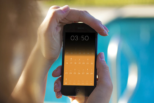
Have you ever opened up a calendar app on your iPhone and wondered why almost the entire screen is taken up by a grid of tiny boxes, most of which represent the past, and all too small to contain any useful information? Amid Moradganjeh has, too. He and his team of ex-Ideo designers have created Peek, an app that throws out most of the assumptions we've attached to digital calendars and rethinks the experience from a minimal, mobile-first perspective. At first glimpse, Peek seems to have a lot in common with Clear, the influential gestural to-do list app. Like Clear, Peek has a flat, "chromeless" interface built around chromatic tiles and clean typography, with accordion-like animations that "unfold" information when you tap on the tiles. "Apps like Clear proved that simple tools that don’t try to do too much can sometimes be more useful," Moradganjeh tells Co.Design. "This is mainly the case for the group of people that are not necessarily that busy, and therefore, don't need an app that thinks for them."

According to Moradganjeh, Peek is aimed at this class of casual calendar users: people who aren't overscheduled CEOs or GTD geeks, but just folks who have stuff to take care of. "For this group, if using a calendar app is not easier than remembering things or writing them on a piece of paper, then they would not use it," he says.

That's why Peek looks more like a strip of brightly colored Post-It notes than a gridded database of appointments. The first things you see when you launch Peek aren't even dates; instead, the app displays large tiles simply labeled "TODAY" and "TOMORROW." Scrolling down further reveals more tiles labeled with forthcoming days of the week. "We learned that people don't perceive time in the form of grids and pages," Moradganjeh says. "So we explored the river model, in which a calendar is a unified timeline with the focus being on the near future." (Scrolling further down or up in this "river" does eventually display a more traditional grid of dates, which makes it easier to reach events further into the future.)

 Moradganjeh says that he based Peek's design on mobile interaction principles he investigated in Rimino, a student concept project he created two years ago (which we covered here). Rimino imagined a post-smartphone device built on lightweight, glanceable notifications rather than visual, highly focused interactions. Instead of displaying a dense thicket of appointment information, Peek surfaces simple, bold reminders that function less as an "outboard brain" for your schedule and more like a red string tied around your finger that helps visually trigger what you already know.

"We learned that most of the time, [casual calendar users] only need the information that can help them 'remember' their schedule," Moradganjeh explains. "This means that an event like 'Lunch with Adam at 12:00' is enough useful information for a user who knows already where she needs to meet Adam."

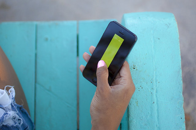
Peek contains some extra interactions that run the gamut from genuinely clever (covering the iPhone's ambient light sensor with your hand or thumb displays a large clock) to extraneously gimmicky (shaking the phone makes Peek cough up aspirational suggestions like "Take the time to relax!"). And the jury's still out on whether focusing an app's UI on gestural interactions isactually convenient or just a passing fad. But Peek's core concept--that most "normal people" don't need deep features and artificial intelligence to help them manage their time when simple, mnemonic microinteractions will do just fine--is a refreshing take on mobile design.


Source: http://www.fastcodesign.com/3025671/ex-ideo-designers-rethink-the-calendar-for-mobile-devices

'Hello Ruby' Teaches 4- to 7-Year-Olds How to Code by Gavin Lau

rubyheader1.jpg

The Kickstarter-funded book, which aims to teach programming principles to children, reached its $10,000 funding goal within hours of its launch, and 24 hours later had amassed $100,000 in donations. The project hit the $200,000 benchmark Jan. 28, with 24 days to go in the campaign. "This is a book to get kids excited about technology and affect the way they perceive technology as they grow up," she says.

The world of programming, Liukas tells Mashable, is perceived as cold, logical and machine-based. But Liukas feels quite differently. She sees in the coding world a universe of creativity and playfulness beyond ones and zeroes.


http://mashable.com/2014/01/28/hello-ruby-coding-book/#:eyJzIjoidCIsImkiOiJfY28xbmQybjNnN2QzMXluNXZncDNwMl8ifQ

Paper from Facebook... by Gavin Lau

Screen-Shot-2014-01-30-at-11.20.12-pm.png

Paper radically re-imagines what Facebook is on a mobile device as a fluid river of cards featuring news articles, photos, status updates, and more, with no ads to sully the experience (yet). It's being released next week on February 3rd, just one day before Facebook's 10-year anniversary, and there's a reason for that: Paper is the opening sentence in Facebook's next 10-year plan. A beautiful app designed from the ground-up with the iPhone in mind, Paper owes its design lineage to a number of other apps. Paper presents the standard Facebook feed in the fluid, elegant style of Flipboard. It makes writing posts as easy as using Medium or Svbtle. Loren Brichter--designer of the original Twitter app, and the popular iPhone game Letterpress-- worked with Facebook to make the interface 99% invisible as possible, with news stories presented in Twitter-like cards, wide photos that pan as you tilt your phone, and UI elements that simply fade away when they aren't in use.

Although Paper isn't out yet, early previews are ecstatic. It's the first app out of Facebook's newly formed Creative Labs division, which is described as a way to allow teams within Facebook build standalone mobile experiences with the same dexterity as start-ups.


http://www.fastcodesign.com/3025755/paper-the-opening-sentence-in-facebooks-next-10-year-plan

Apple to Build Mobile-Payments by Gavin Lau

iphone-payment.jpg

Eddy Cue, the company's senior vice-president of Internet software and services, has met with "industry executives" to discuss Apple's role in handling payments for physical goods and services, The Wall Street Journal reported. The mobile-payments space is hot, with companies such as Square, PayPal and Stripe all working to make it easier for users to pay for physical goods with their phones.

Apple sells billions of dollars worth of movies, music, books and apps through iTunes. Still, aside from allowing customers at Apple retail stores to scan and pay for physical items inside the store via an iPhone, Apple hasn't extended its payments ecosystem outside of the digital realm.

That doesn't mean the company could't instantly become a major player in the mobile-payments space overnight, thanks to its absolutely huge iTunes customer base.


http://mashable.com/2014/01/25/apple-mobile-payments-2/#:eyJzIjoidCIsImkiOiJfY28xbmQybjNnN2QzMXluNXZncDNwMl8ifQ

more human, way to manage your network of contacts by Gavin Lau

Humin1-786x305.jpg

The contacts app that ships with iOS is a pretty straightforward affair that doesn’t offer much more than the handwritten address books we used to keep next to our landline phones. Humin is a new app that will be launching in beta this week that aims to be a smarter way for iPhone users to manage their contacts. Humin’s name doesn’t echo the word ‘human’ for nothing – co-founder and CEO Ankur Jain wants his startup’s product to understand relationships the way that you do. We don’t think of our network of contacts as an alphabetical list of names, our brains organise our contacts in more complex ways, but ways that make sense to us – where we met people, where they work, what they look like, who they know, and the like. Humin wants to tap into that subconscious human logic without you having to do anything differently.


http://tnw.to/stDX

HTML5 Vs. Native debate obscures the real challenges of mobility by Gavin Lau

04-HTML5-vs-Native.008.png

The vitriol spews on a daily basis. HTML5 or native apps? Each side is well armed with arguments and data to prove their points. This fight, destined to go on for a long while, masks some of the real problems that enterprises are facing when it comes to mobile applications. Do you have the right backend architecture for a mobile world? The right business analytics? Enterprises, brands and developers need to put their houses well in order before even beginning to answer what type of code an app will be built in.  

http://readwr.it/q0zV

Smart Tennis Sensor by Gavin Lau

Screen-Shot-2014-01-21-at-12.32.11-am.png

Sony showed off a prototype tennis racket sensor at CES 2014 that promised to track useful data about your technique and transmit it to your smartphone. That prototype has turned into reality faster than we thought it might — the final product now has a name, a price, and a release date for Japan...  

http://vrge.co/1iefefI

Introducing a brand new way to play music by Gavin Lau

bang-olufsen-ces-2014-1.jpg

Bang & Olufsen is aiming to take the music you listen to on a smartphone and put it on the wall. The BeoSound Essence is a hockey puck-shaped music controller that reduces the number of actions you need to perform to one: just tap, and the music will start playing. What music, you ask? That depends on what you were playing last. The dial on the wall is just the first part of the product. The second part is a hideaway box that is wired to your speakers and communicates wirelessly with music sources. Those sources can be smartphones, tablets or PCs — anything with Wi-Fi connection. The Essence is compatible with Apple AirPlay, Spotify Connect and standard DLNA connections.

7 Minute Workout' App by Gavin Lau

Gym_App.jpg

Last month, Apple offered a free holiday playlist through the Apple Store app for iPhone. This month, in the same manner, it's offering the 7 Minute Workout Challenge app for free, effectively encouraging users to "jump into the new year."  

http://mashable.com/2014/01/11/7-minute-workout-challenge-app-free/#:eyJzIjoidCIsImkiOiJfY28xbmQybjNnN2QzMXluNXZncDNwMl8ifQ

Apple Gets Serious About The iPad’s Creative Power In New Ad by Gavin Lau

Screen-Shot-2014-01-13-at-11.41.03-pm.png

Apple aired a new iPad advertisement during the NFL playoff game between the San Francisco 49ers and the Carolina Panthers today, and it’s all about creativity. It’s no secret that Apple wants to push the creative aspect of its mobile devices, which are still seen largely as consumption gadgets, and this new ad embraces a grand vision of iOS as fertile ground for inspiration and creation. “What will your verse be?” is the tagline for the ad, and the idea is that each person gets to contribute one verse to the overall poem of human experience (which is a terrible poem by the way). The iPad in the commercial is used in a number of different creative capacities, including as a filming accessory, as a prototyping tool, as a means for writing, and as a way to 3D prototype and work in the depths of the ocean...


http://techcrunch.com/2014/01/12/apple-your-verse-ipad-ad/

iPad-mounted Structure Sensor 3D scanner by Gavin Lau

Screen-Shot-2014-01-11-at-12.49.03-am.png

Augmented reality has never been nearly as cool as its name suggests. Even when it isn't gimmicky, it's virtually useless, in large part because your mobile camera's version of "reality" is short one dimension. Scanning and computer vision company Occipital, however, wants to add real depth to your tablet's vision with the Structure Sensor, a Kickstarter- backed product that shipped to backers late last year. The $349 Structure Sensor is a Kinect-like camera that fits on the back of an iPad or, with some hacking, any other device. With the bracket on, your tablet doesn't just see objects, it can figure out how far away they are, doing anything from turning an object into a 3D model to measuring the distance of a room. http://vrge.co/1lGoBVh

iPhone case uses electromagnetic radiation to power its LED notification lights by Gavin Lau

lune-case1.jpg

The Lune case, developed by gadget startup Concepter, does just that. With no battery or power connection to your iPhone, the case can light up when you receive a call. Concepter was showing off the case at Eureka Park, the early-stage startup section of the International CES.


http://venturebeat.com/2014/01/08/this-iphone-case-uses-electromagnetic-radiation-to-power-its-led-notification-lights

ZTE Eco-Mobius modular smartphone by Gavin Lau

6670-e0c6123c_680_400.jpg

To compete with Motorola's Project ARA, Chinese company ZTE has announced their very own modular Smartphone concept. Eco-Mobius is on display at ZTE's booth in Las Vegas, and the concept phone looks very similar to what Motorola had shown us months ago. Modules such as CPU core, RAM, camera, battery, etc. are all fixed to one another using magnets, allowing for easy replacement. Upgrading components of a phone rather than changing the entire phone can turn out to be both cheaper and more environmentally friendly...  

http://www.nextpowerup.com/news/6670/zte-shows-off-eco-mobius-modular-smartphone-concept.html


The Best Calendar iPad App - Sunrise by Gavin Lau

ipad_screenshot05.png

Calendar app Sunrise released a major update today, completing two missing pieces of the complicated calendar puzzle — you can now use Sunrise on your iPad with a new design tailored for bigger screens, and there is a much-requested week view to get a better picture of what your schedule looks like. Finally, the company added background updates so that your calendar is always up to date when you open the app. “We realized that mobile is an even bigger paradigm shift than we originally thought,” co-founder and CEO Pierre Valade told me. “Every other day, I don’t even use a computer anymore — I consider the iPad as a mobile device. People want to feel productive anywhere, and work from their iPad. So that’s why we built Sunrise for the iPad.”


http://techcrunch.com/2014/01/09/sunrise-adds-ipad-app-and-week-view-in-its-quest-to-build-the-best-calendar-platform

Fridges Sing and Countertops Find Recipes by Gavin Lau

Whirlpool.jpg

LAS VEGAS — Whirlpool is showing off an interactive cooktop concept at 2014 International CES that not only turns a typical kitchen surface into a stovetop, but also a place to check the weather, find recipes on Pinterest, research cooking tips and post pictures to Facebook. Although the concept isn't a reality just yet, Whirlpool is calling it the "kitchen of 2020," which could integrate hands-free devices and touchscreens into the kitchen itself.


http://mashable.com/2014/01/07/whirlpool-cooking-concept/#lead-image:eyJzIjoidCIsImkiOiJfY28xbmQybjNnN2QzMXluNXZncDNwMl8ifQ

Tiny cube camera by Gavin Lau

Screen-Shot-2014-01-07-at-10.43.42-pm.png

Polaroid's Socialmatic isn't the only surprise to come from the faded photo brand at this year's CES. The company also showed off a line of four action cameras, including an adorable new 35-mm cube camera called the C3. It will ship for $99 later this summer. For its small size, the camera is packed full of a surprising degree of features, including a 120-degree wide-angle lens capable of capturing HD video in 1280 x 720 and 640 x 580 resolution, and still images up to 5 megapixels. It's waterproof up to 2 meters (6.6 feet), and contains 2MB of internal storage, and a micro SD slot expandable up to 32 GB. It also has a microphone and an LED light. http://vrge.co/K0kLao

iPhone-controlled paper airplanes by Gavin Lau

powerup1.jpg

PowerUp is building a little device that converts paper airplanes into smartphone-controlled flyers. This project has raised nearly $850,000 on Kickstarter, raising 1,688 percent of its $50,000 goal — and it still has 24 days to go.

“Our goal is to make you feel like the Wright Brothers when Flyer I took to the skies,” inventor Shai Gotein told VentureBeat’s Dean Takahashi in November. “We want to empower you to design your own flyer and conquer the skies with our module.”

PowerUp’s module has an ultralight weight mini-computer on one side that is about the size of a quarter. Bluetooth low energy connects it to your smartphone, and a lithium battery power pack charges it. A thin carbon-fiber frame connects the computer to a little propeller on the other end.


http://venturebeat.com/2013/12/31/powerup-racks-up-850k-on-kickstarter-for-iphone-controlled-paper-airplanes

iOS: A visual history by Gavin Lau

Screen-Shot-2014-01-05-at-4.57.28-pm.png

Apple's Steve Jobs introduced the iPhone to the world on January 9th, 2007. In the five-plus years since then, the iPhone, iPad, and iPod Touch have literally redefined the entire world of mobile computing. That world is moving so quickly that iOS is already amongst the older mobile operating systems in active development today. That certainly doesn't mean it's underpowered or underfeatured — quite the contrary. Through what can only be described as relentless and consistent improvement over the years, Apple has made iOS one of the most feature-rich and well-supported platforms on the market. http://vrge.co/vd6Fhb